I am passionate about the potential of design to shape a better, more inclusive world.


Chanukah in Union Square (Event Branding)
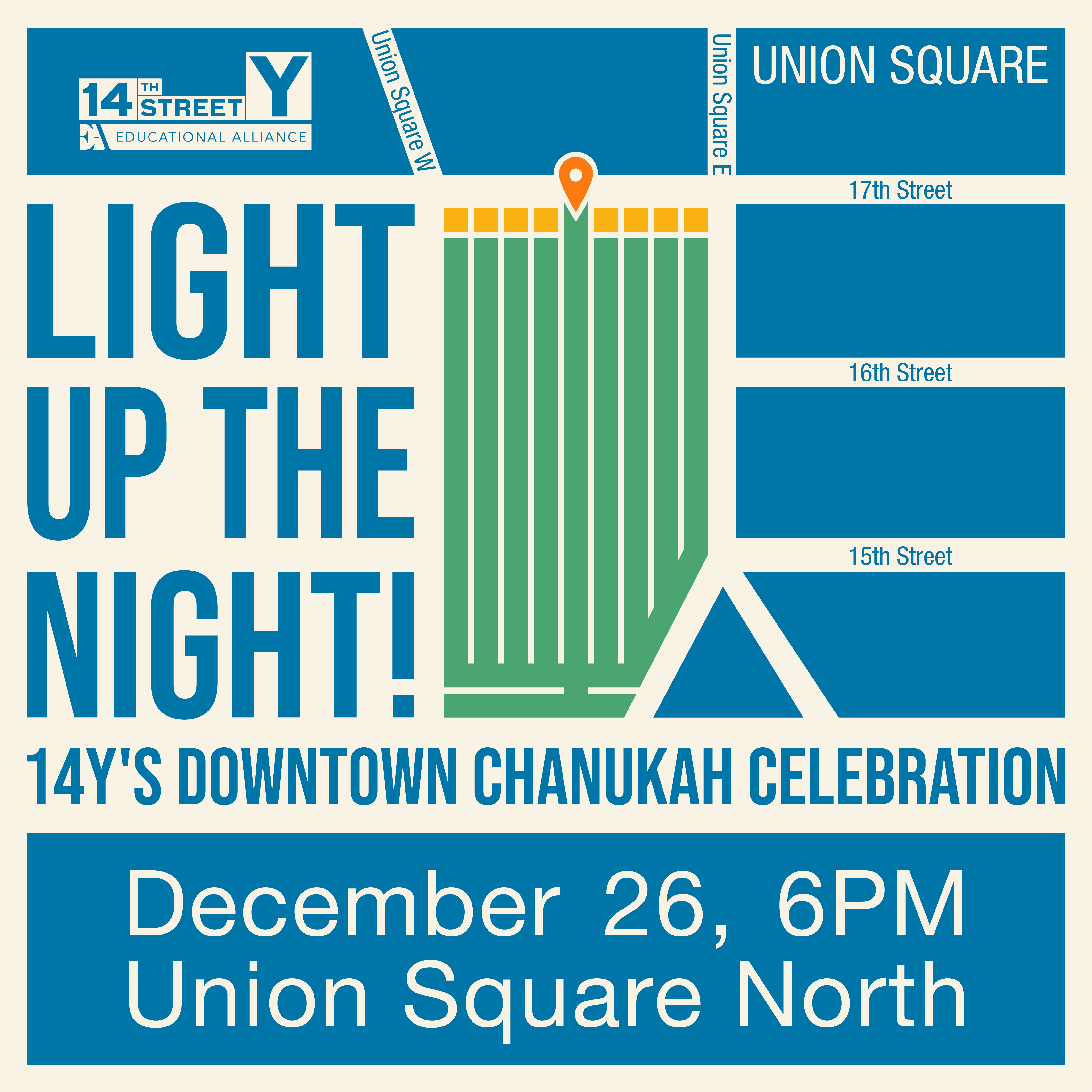
I designed the event branding for the 14Y’s first ever Chanukah candle lighting in Union Square. To celebrate this event happening at such an iconic location, the design is both a menorah and a map to the exact location of the candle lighting with the shamash (helper candle) also functioning as a location marker. I created the physical and digital materials to promote this program, as well as adapted signage for the after party at the 14Y.
I designed the event branding for the 14Y’s first ever Chanukah candle lighting in Union Square. To celebrate this event happening at such an iconic location, the design is both a menorah and a map to the exact location of the candle lighting with the shamash (helper candle) also functioning as a location marker. I created the physical and digital materials to promote this program, as well as adapted signage for the after party at the 14Y.


14th Street Y (Vinyl Window Mural)
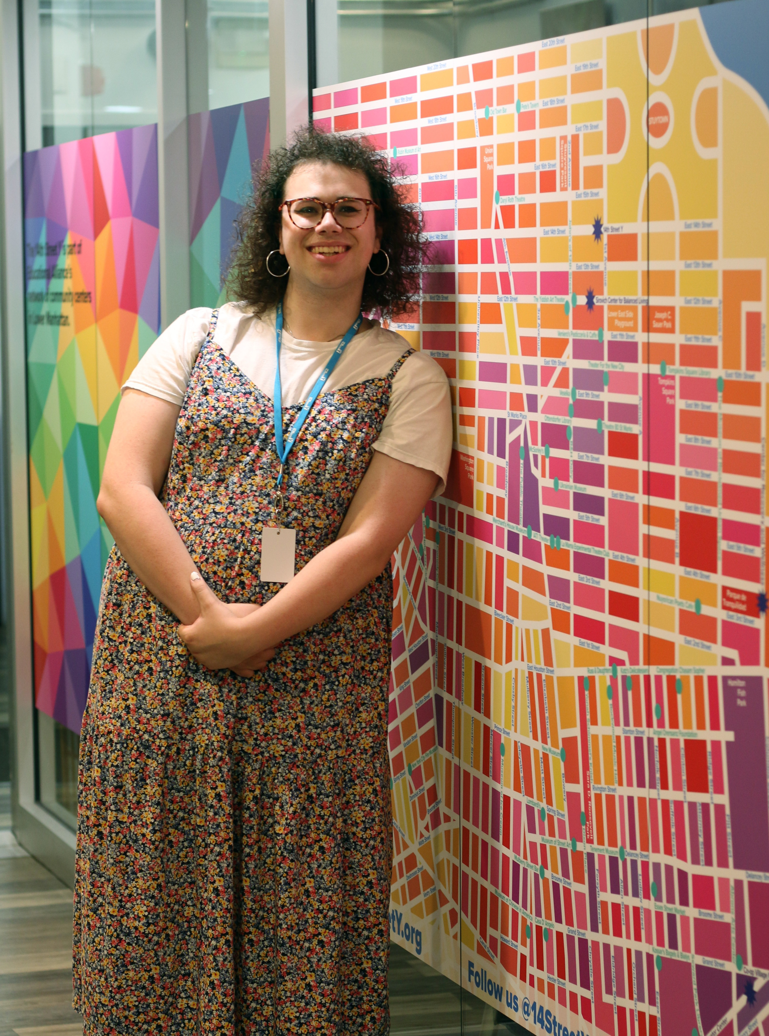
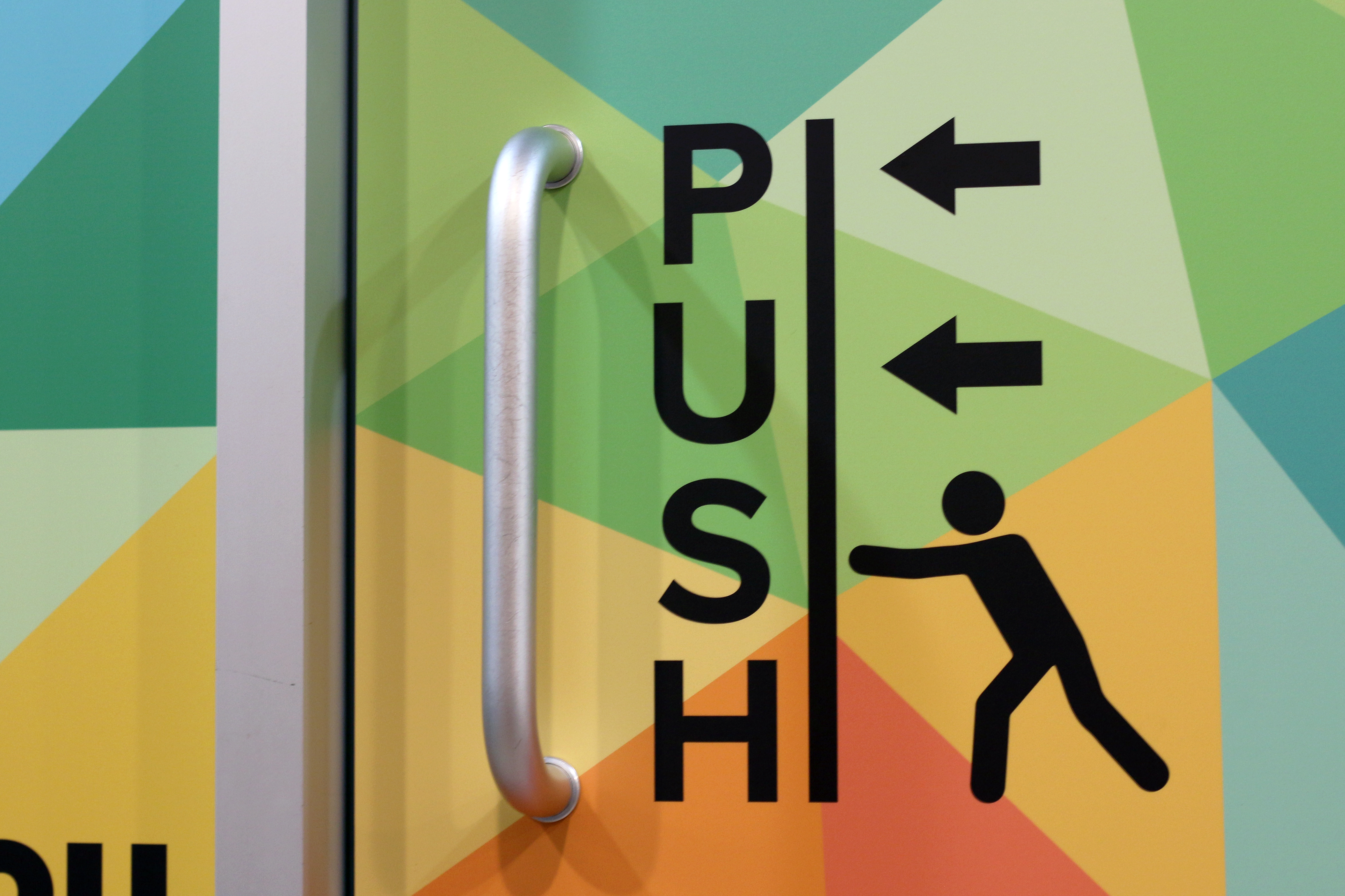
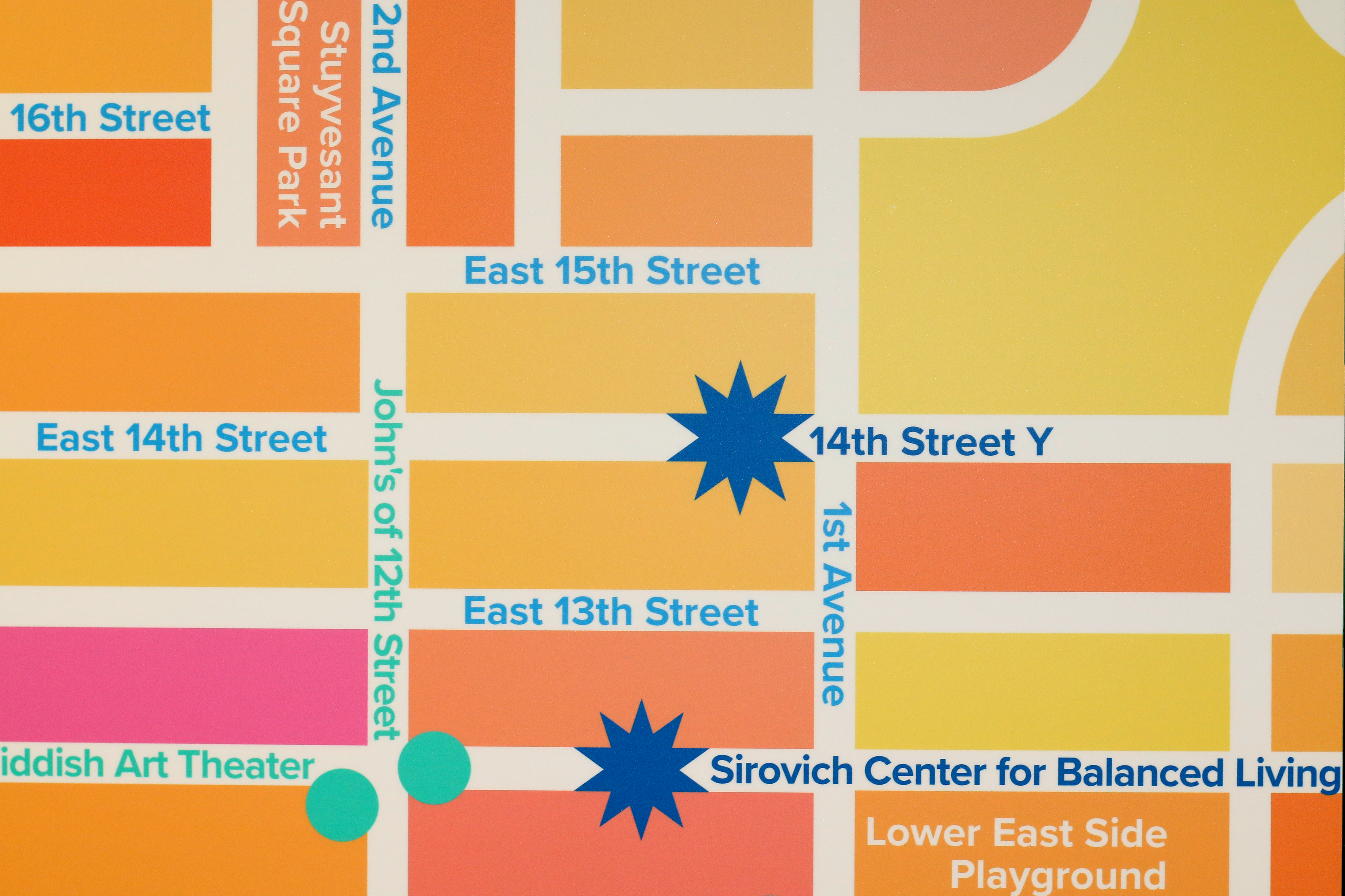
I designed a 9-panel mural to go on the office windows in the hallway between the lobby and fitness center. This mural accomplishes several goals, the first of which is the building directions that advertise the many features of the building to members only familiar with fitness. The labeled door panels help bring clarity to what the lobby offices are for, and clear up any push or pull confusion. The three-panel map was created to show off all of Educational Alliance’s programs across lower Manhattan, as well as many other places of importance suggested by the 14Y staff. Designing and labeling an entire map of lower Manhattan was a very fun and thorough process and a whole new way to experience the city!
I designed a 9-panel mural to go on the office windows in the hallway between the lobby and fitness center. This mural accomplishes several goals, the first of which is the building directions that advertise the many features of the building to members only familiar with fitness. The labeled door panels help bring clarity to what the lobby offices are for, and clear up any push or pull confusion. The three-panel map was created to show off all of Educational Alliance’s programs across lower Manhattan, as well as many other places of importance suggested by the 14Y staff. Designing and labeling an entire map of lower Manhattan was a very fun and thorough process and a whole new way to experience the city!


Educational Alliance (Window Clings)
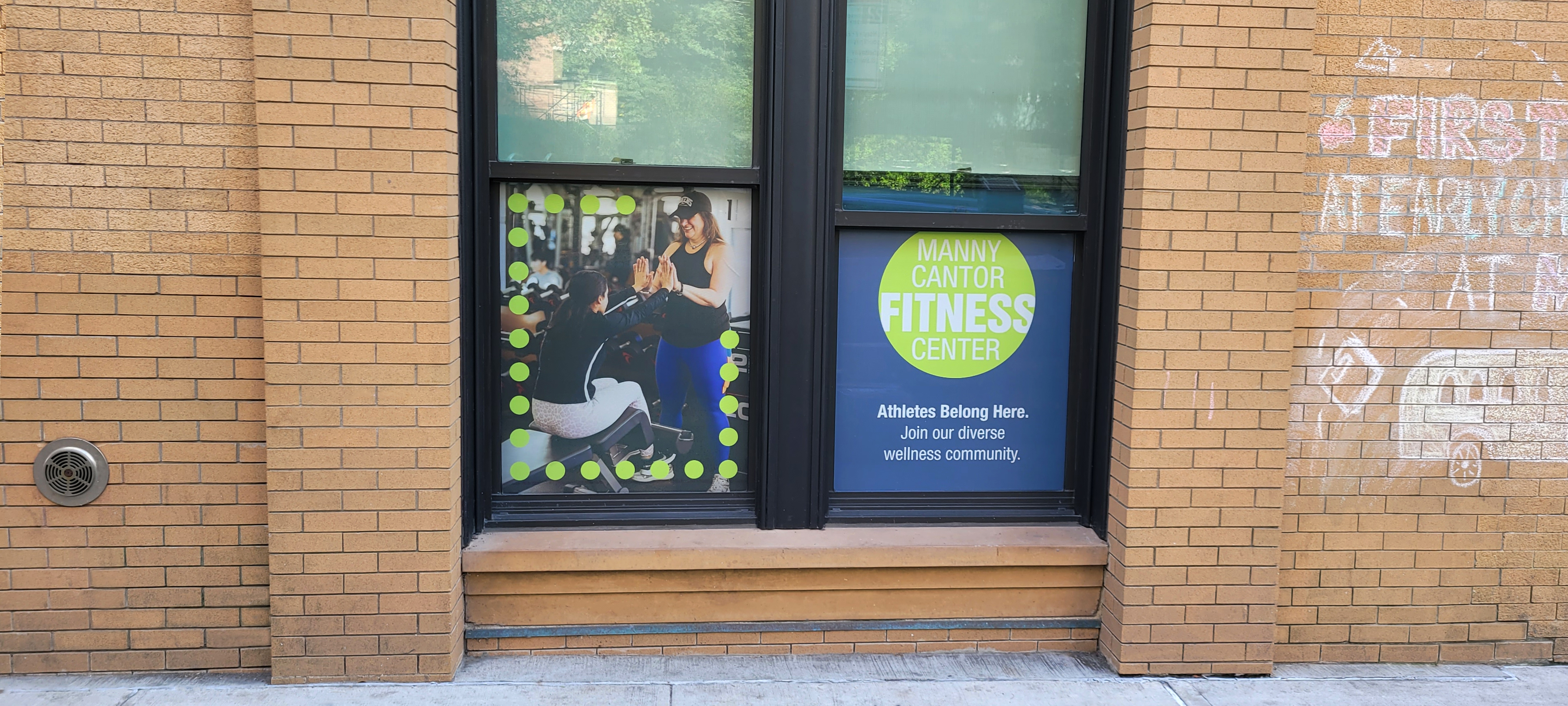
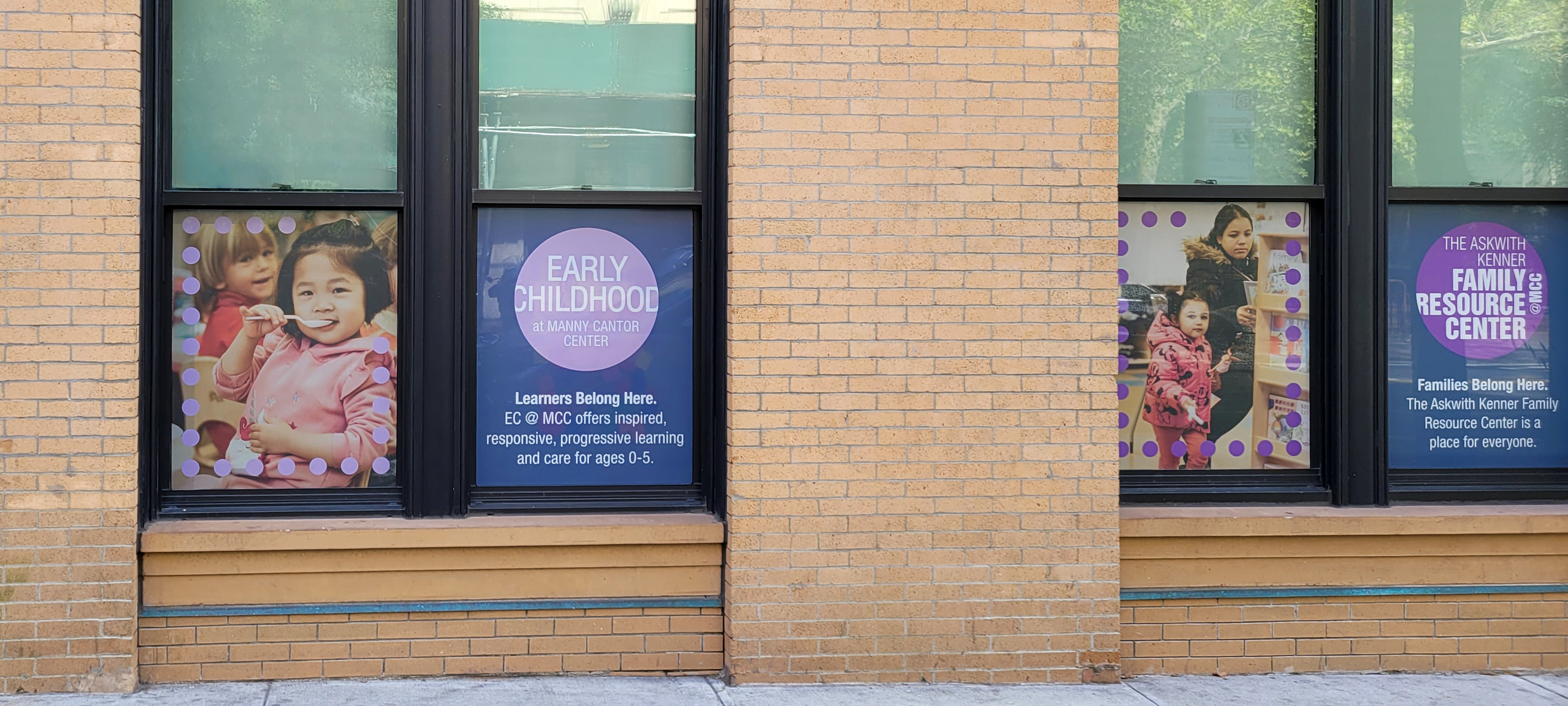
It was an incredible honor to design a series of window graphics for the Manny Cantor Center (MCC), EA’s historic flagship building. The clings highlight the community center’s wide variety of programs and further establish the unique color for each one. I had noticed an under-utilized piece of MCC’s visual language in their gridded dot patterns and reimagined them as frames to be broken by their dynamic imagery. This gives the windows an added dimensionality to catch the eyes of passersby on the Lower East Side, and seeing them stop and look is one of the most rewarding feelings.
It was an incredible honor to design a series of window graphics for the Manny Cantor Center (MCC), EA’s historic flagship building. The clings highlight the community center’s wide variety of programs and further establish the unique color for each one. I had noticed an under-utilized piece of MCC’s visual language in their gridded dot patterns and reimagined them as frames to be broken by their dynamic imagery. This gives the windows an added dimensionality to catch the eyes of passersby on the Lower East Side, and seeing them stop and look is one of the most rewarding feelings.

Educational Alliance (Booklet)
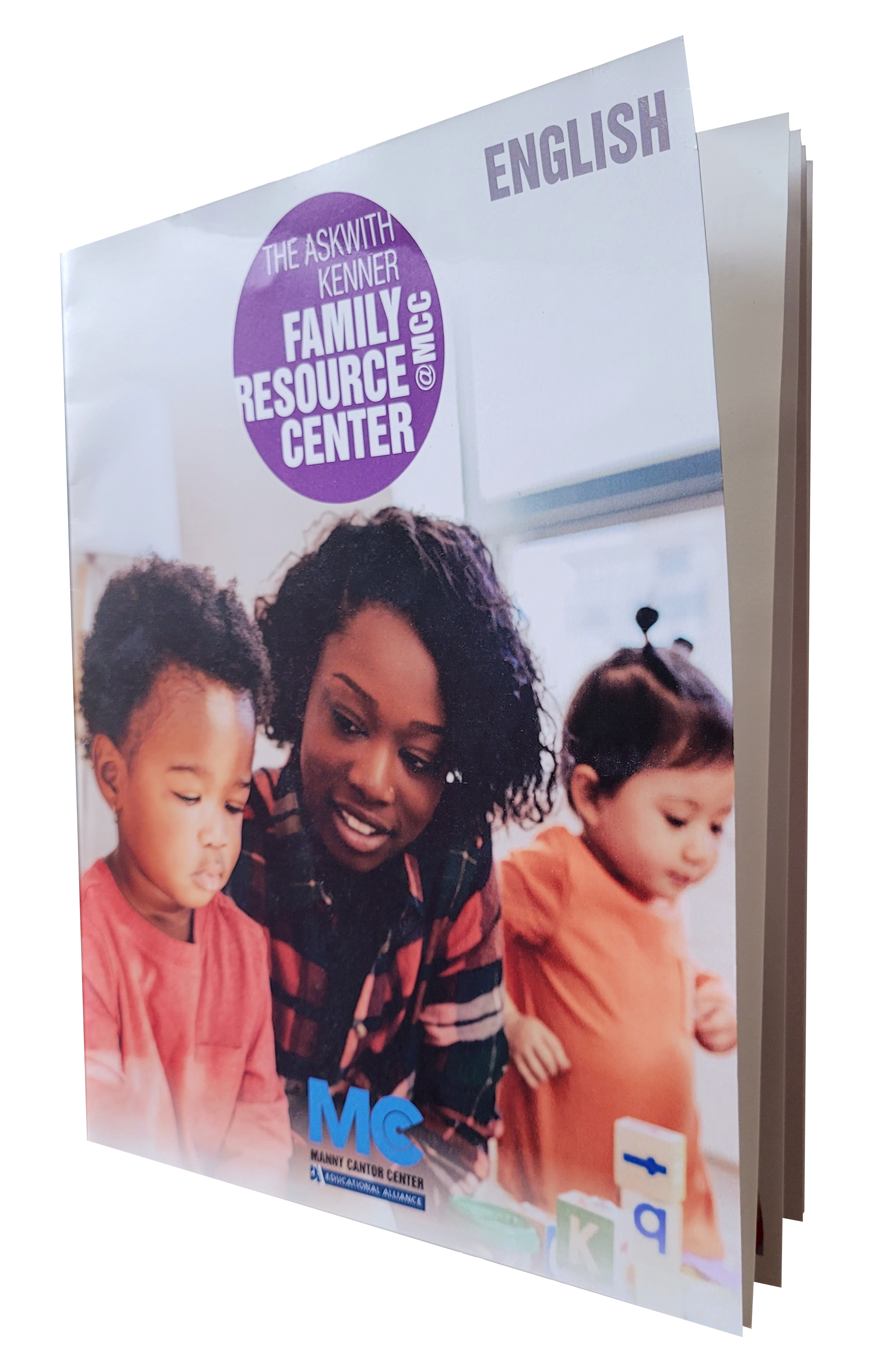
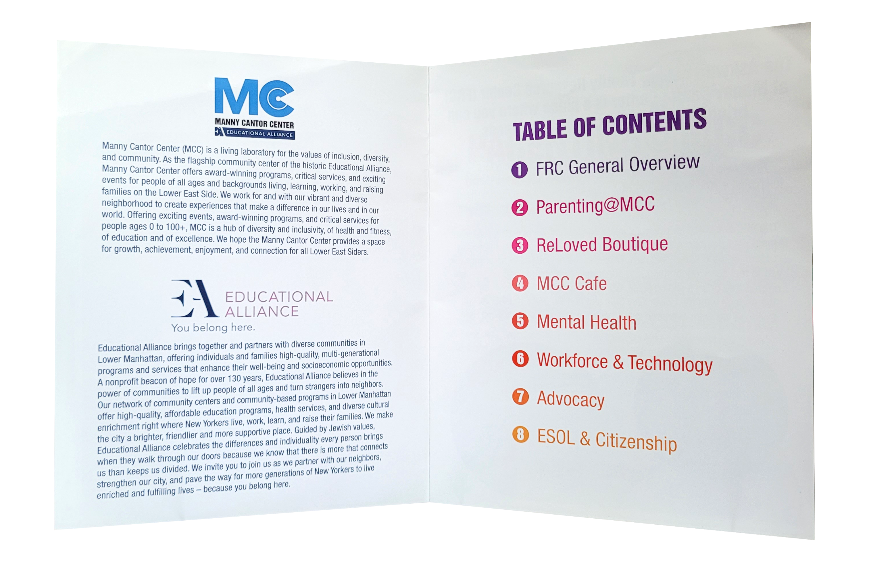
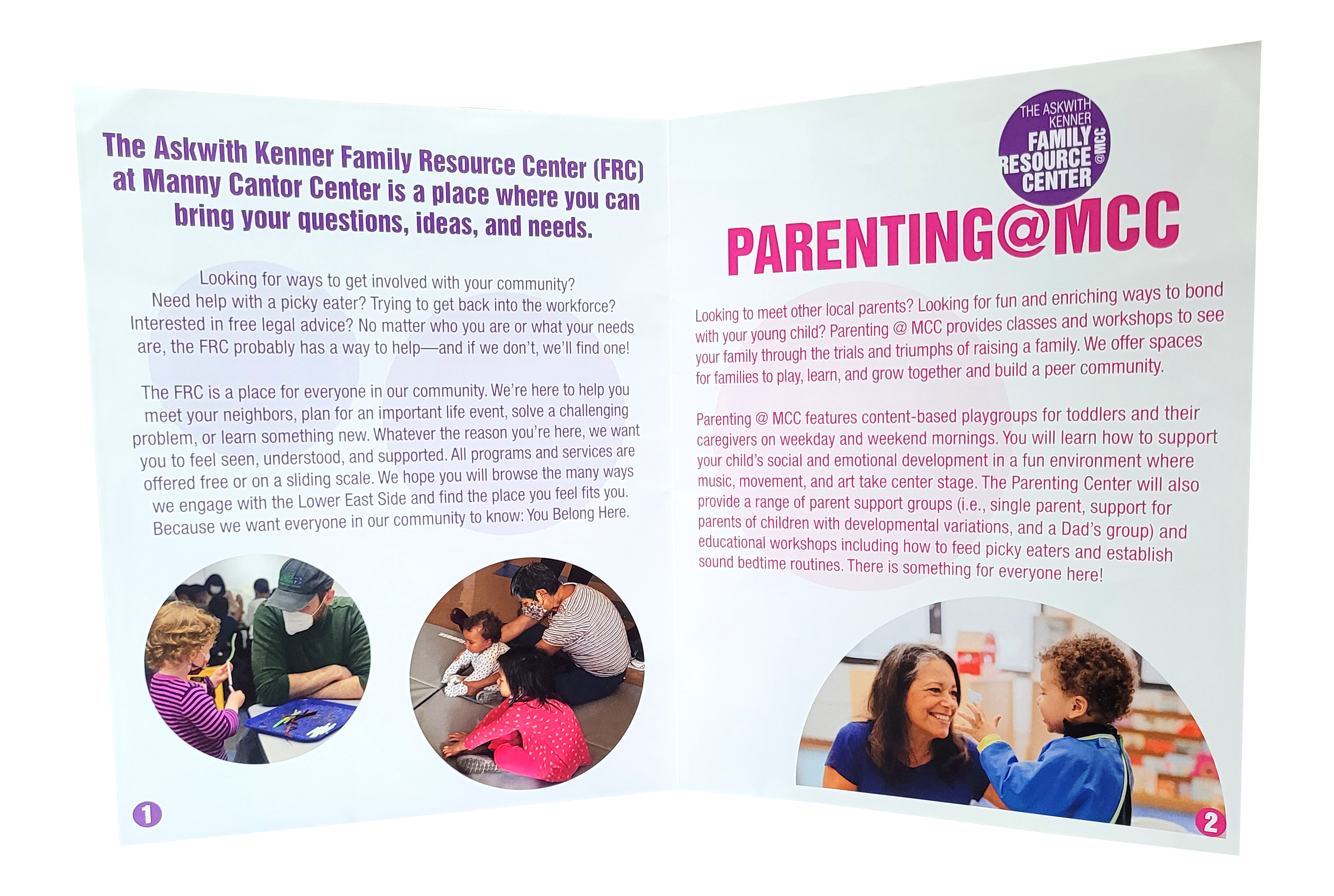
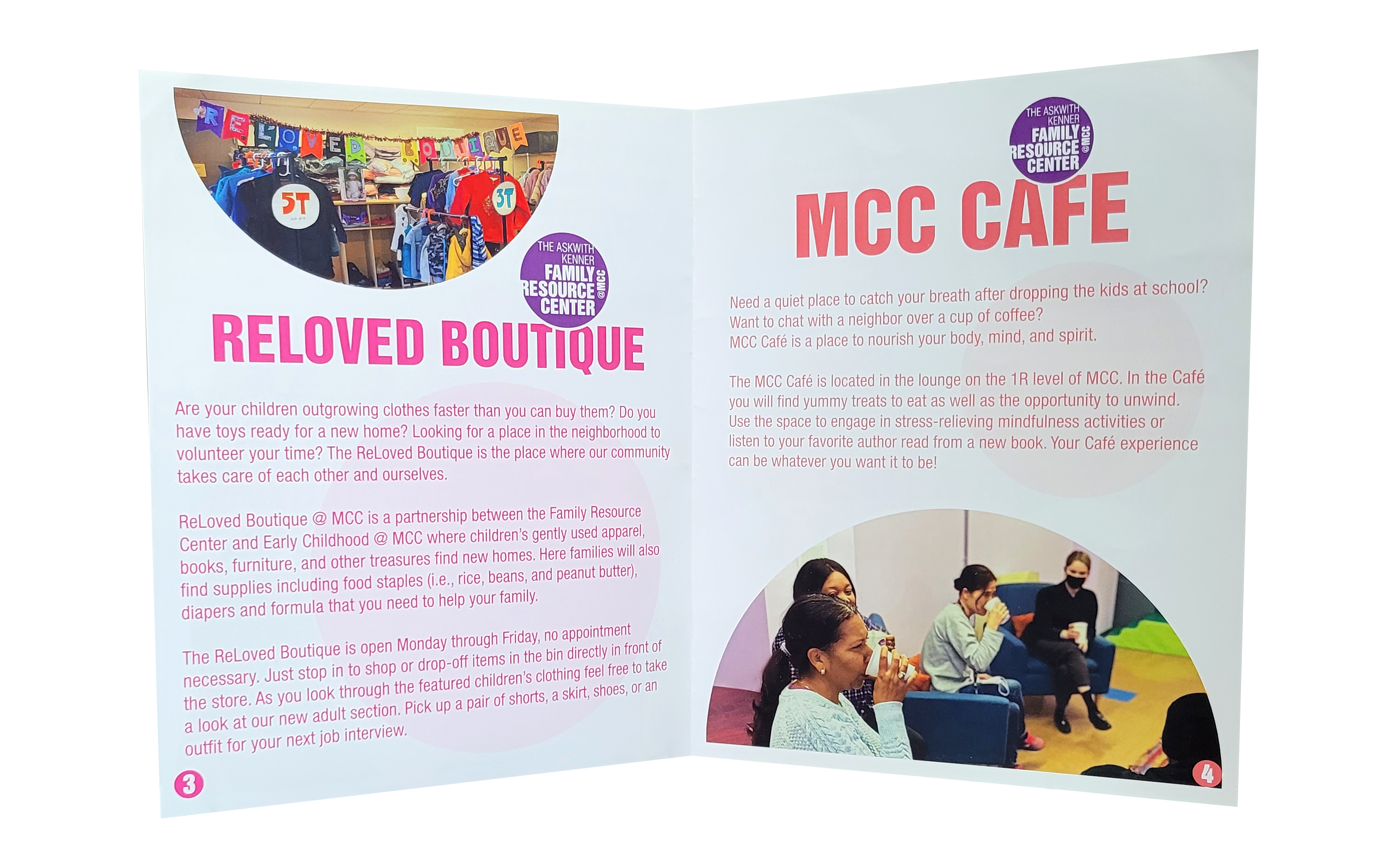
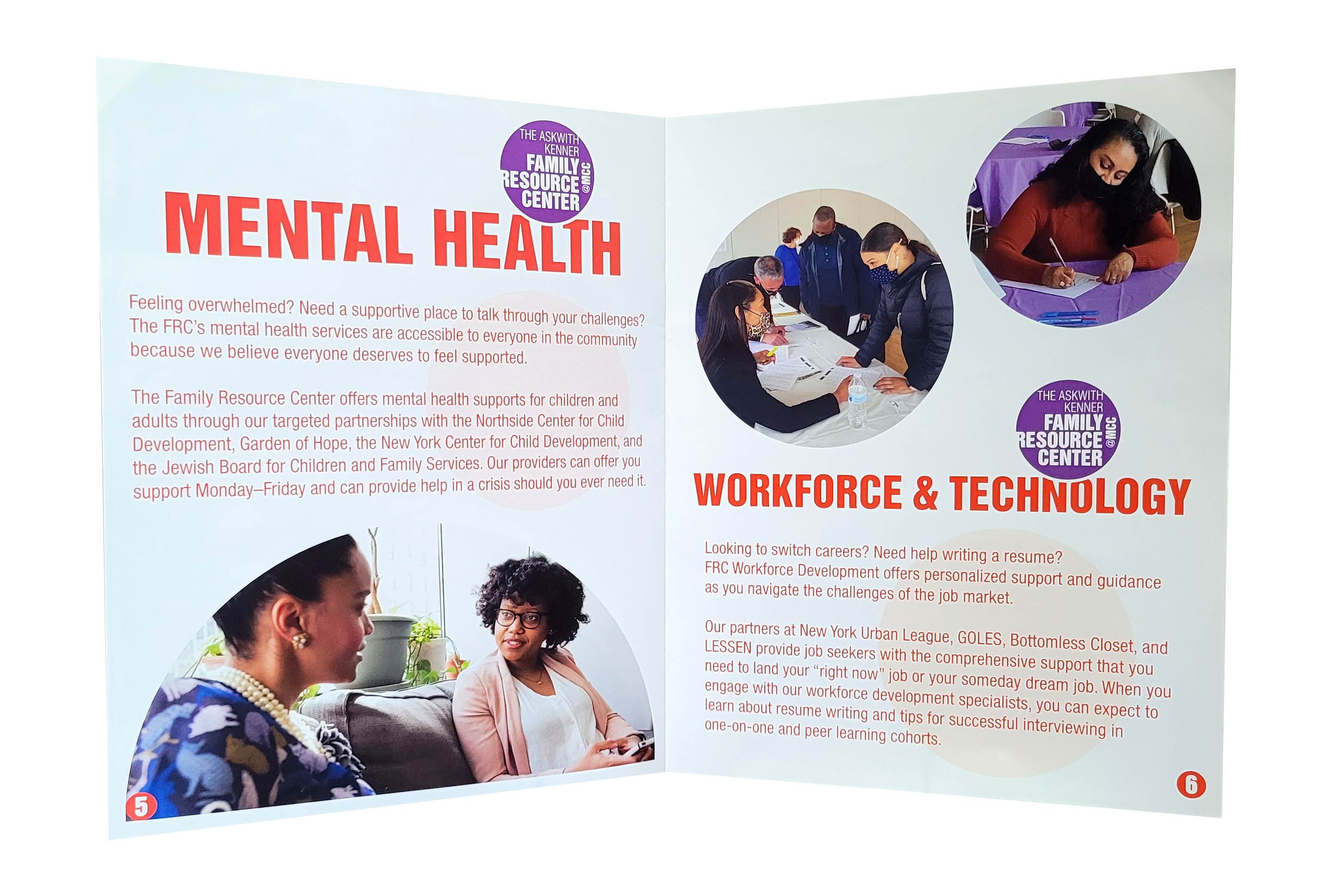
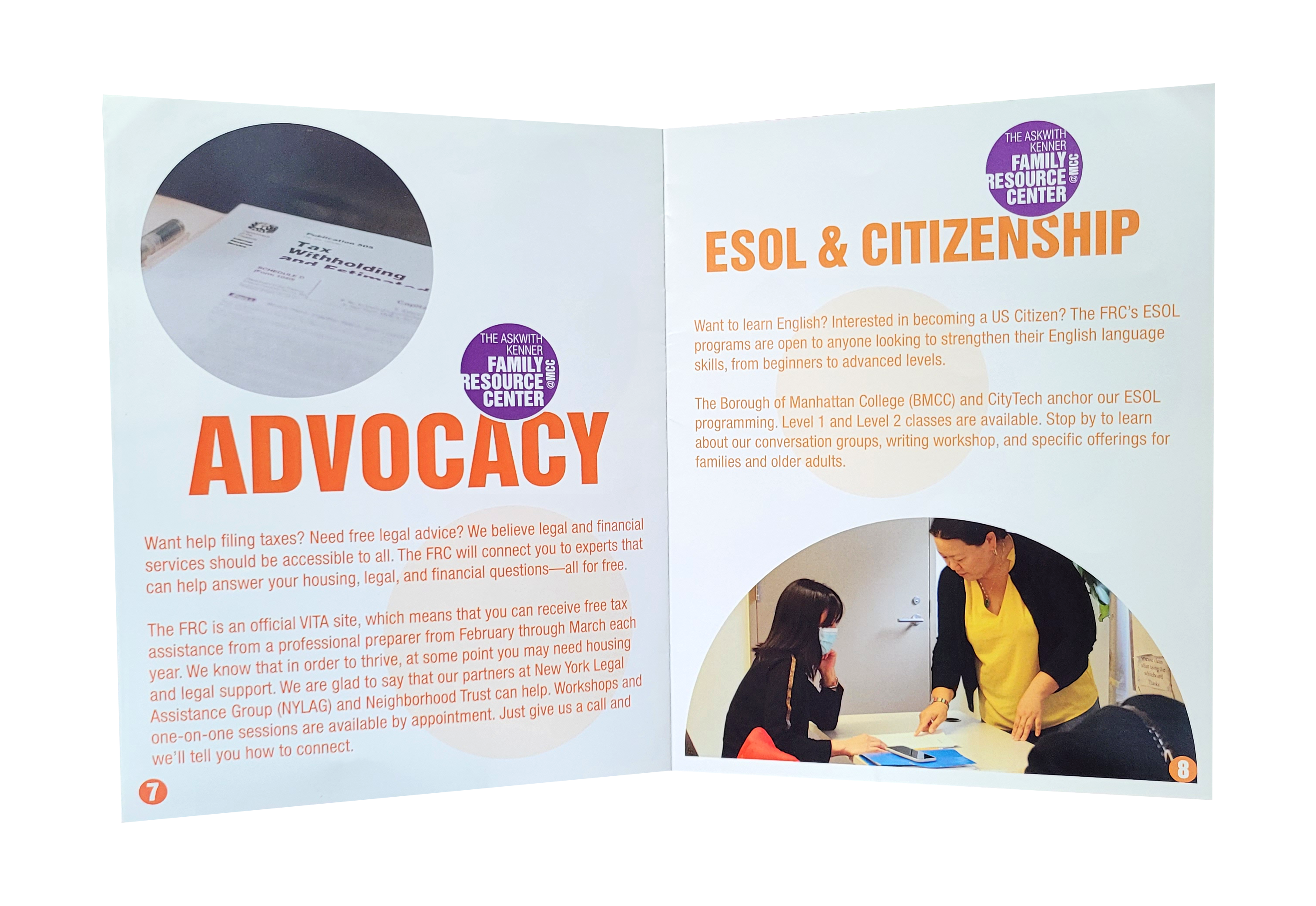
When the Manny Cantor Center’s Family Resouce Center (FRC) got a new visual identity, I was asked to create a booklet to highlight each program and introduce its branded color. The use of circles serves as a visual link between the FRC and the brand identity of the Manny Cantor Center while giving the booklet a dynamic composition. As part of their mission of inclusivity, Spanish and Chinese translations were also produced. This was the first time I had designed materials in another language, which taught me a lot about creating consistent compositions with copy that varies in amount and appearance. I have gone on to design plenty of translated collateral for the Manny Cantor Center.
When the Manny Cantor Center’s Family Resouce Center (FRC) got a new visual identity, I was asked to create a booklet to highlight each program and introduce its branded color. The use of circles serves as a visual link between the FRC and the brand identity of the Manny Cantor Center while giving the booklet a dynamic composition. As part of their mission of inclusivity, Spanish and Chinese translations were also produced. This was the first time I had designed materials in another language, which taught me a lot about creating consistent compositions with copy that varies in amount and appearance. I have gone on to design plenty of translated collateral for the Manny Cantor Center.


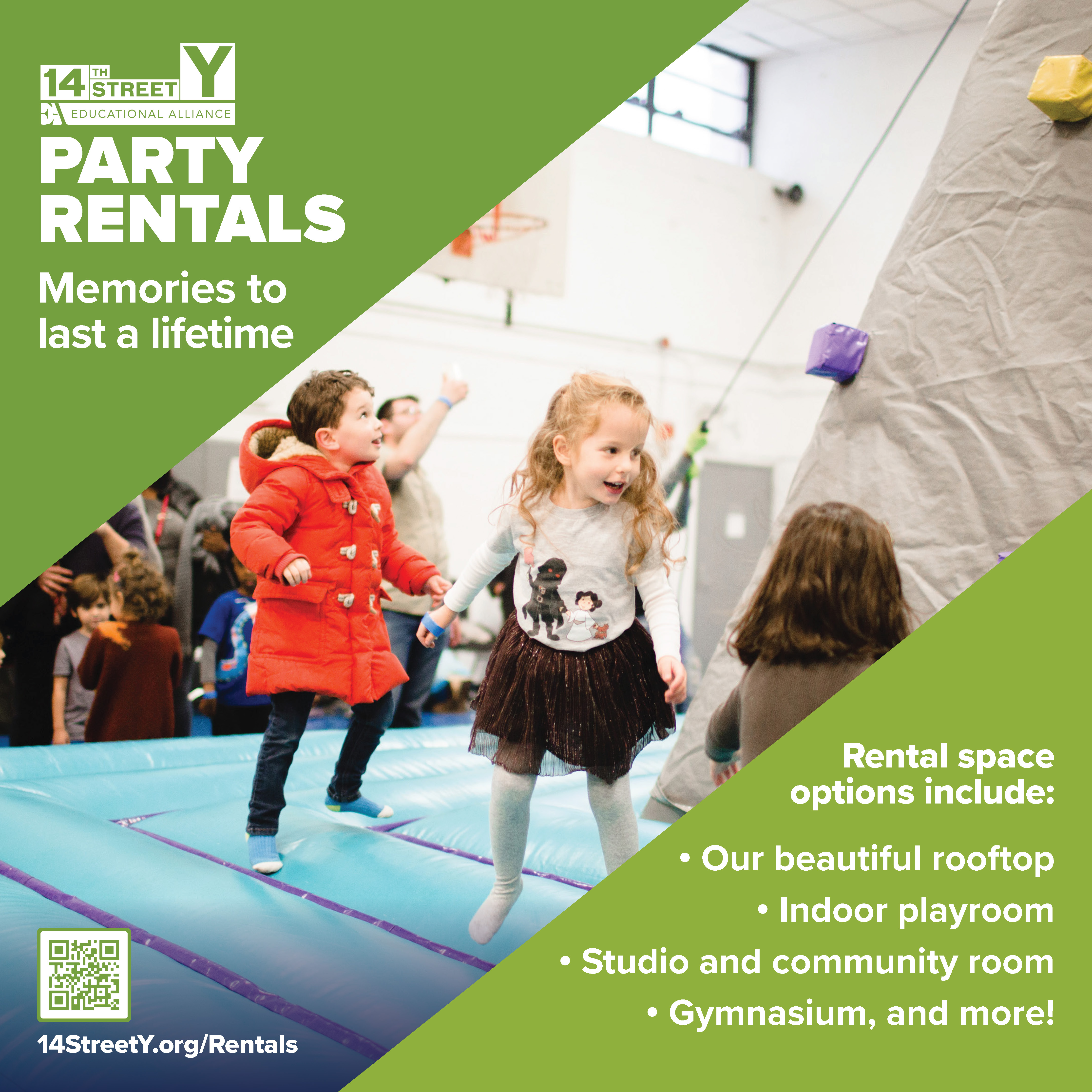
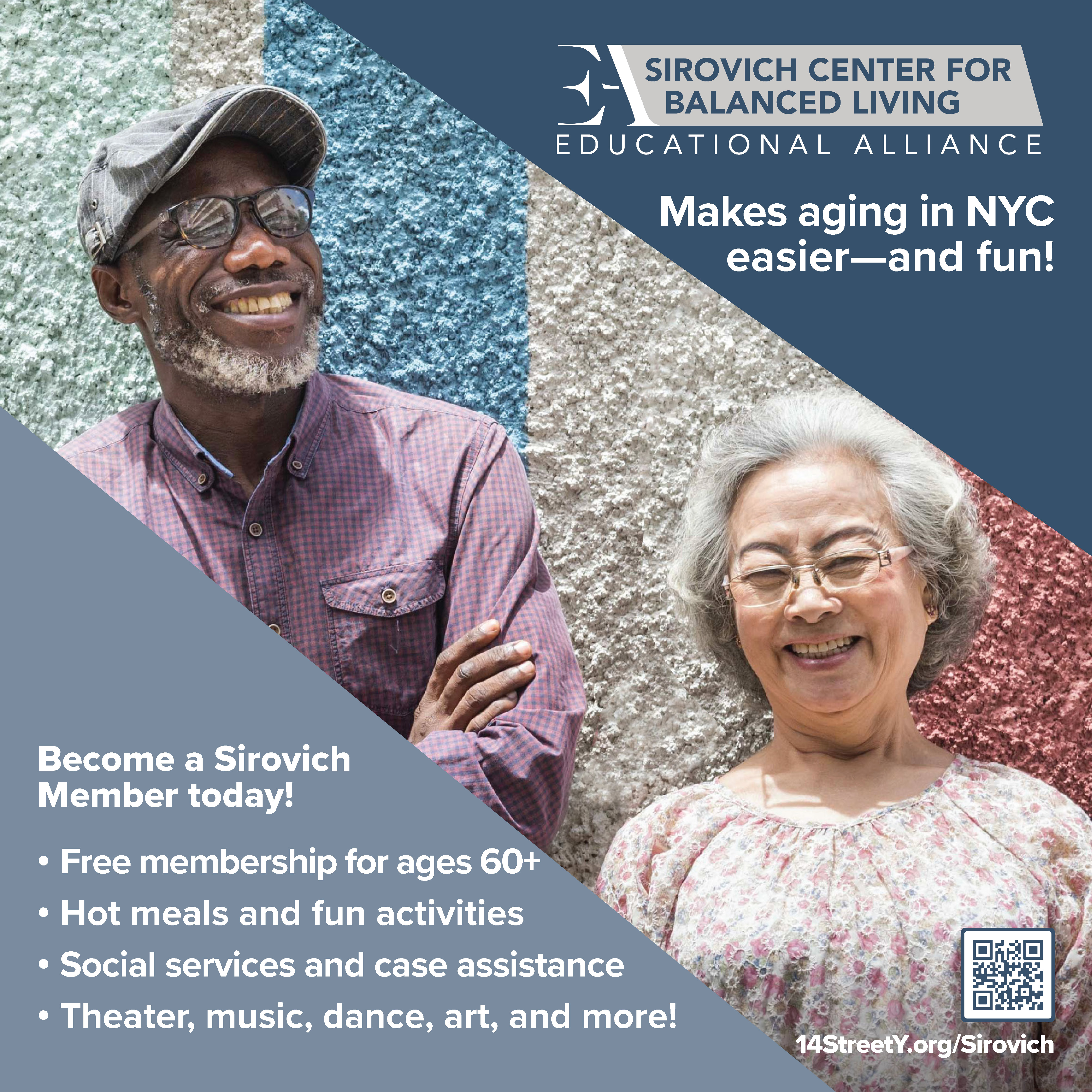
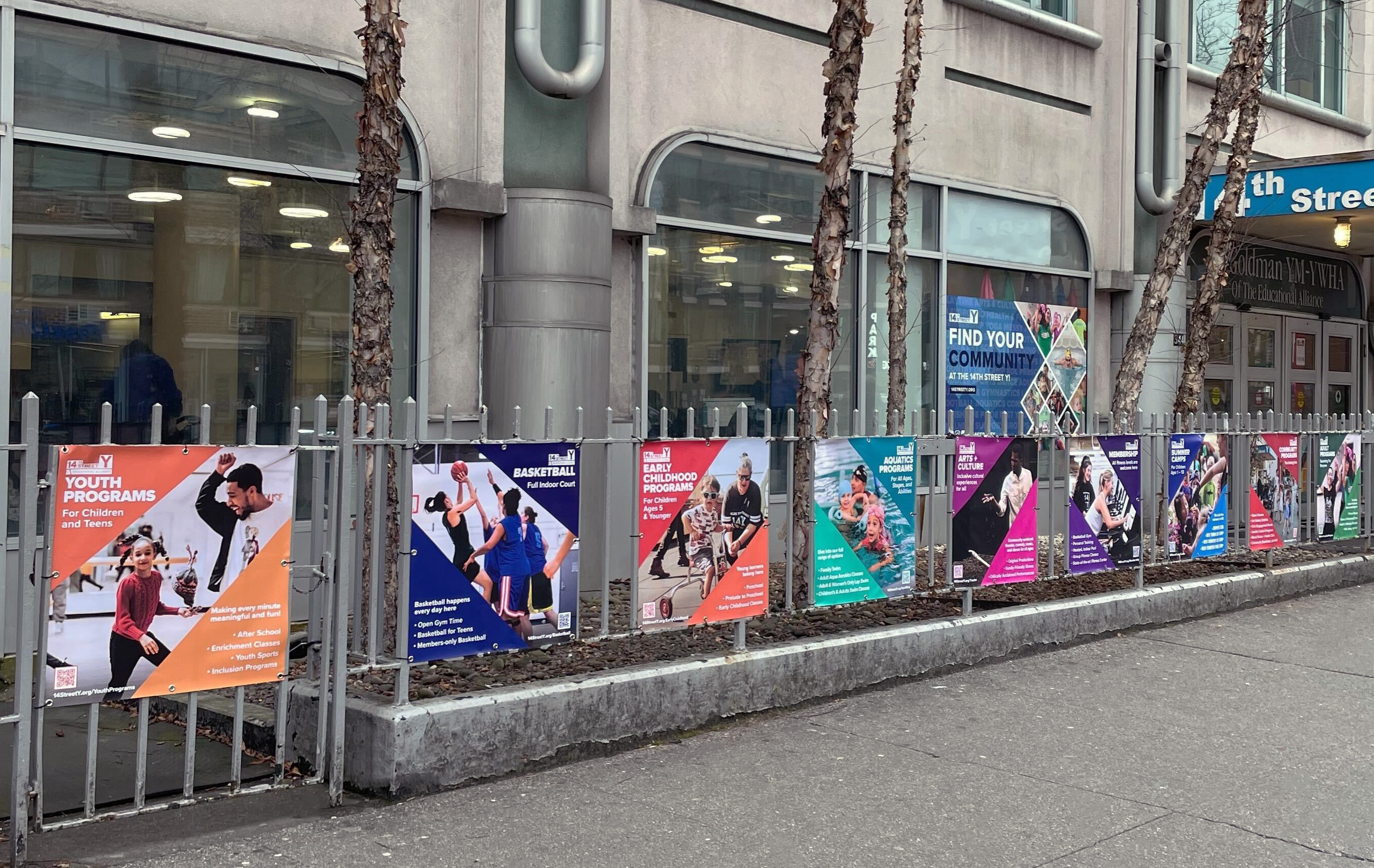
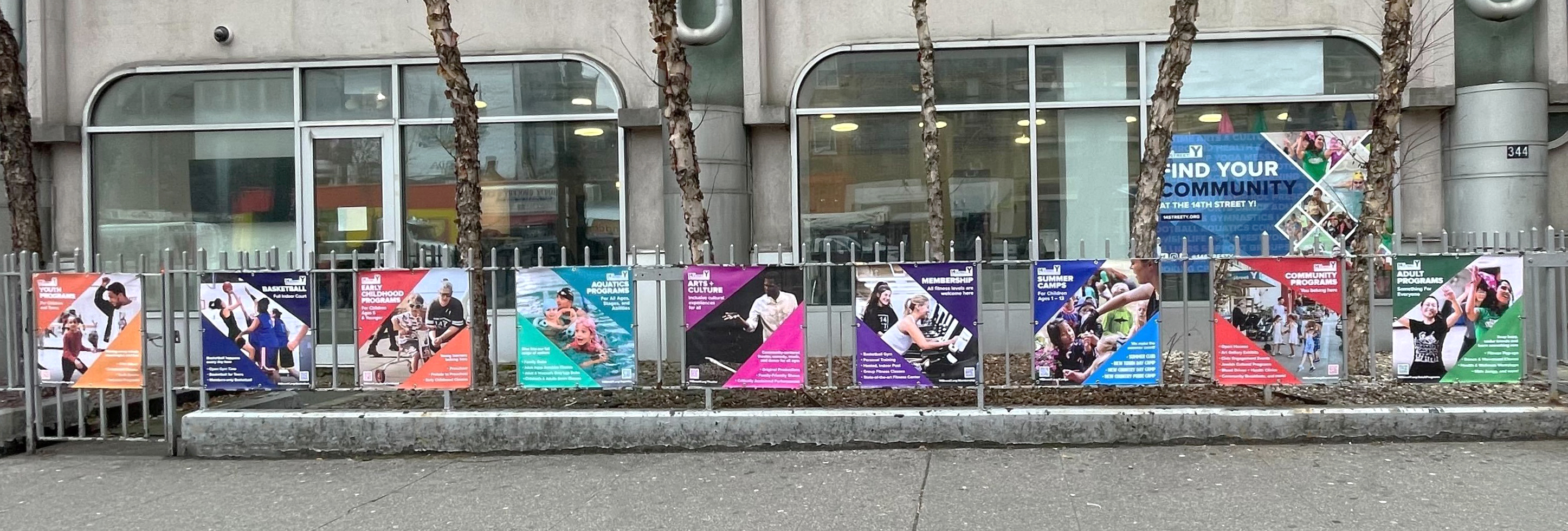
14th Street Y (Banners)
The fence outside of the 14Y offers up some great real estate for promotional banners, but the long banners were very easy to tear down. The solution was to create a new fleet of posters in a more compact, square design that allowed for a greater number of banners to hang out front. Banners were created for each program category offered at the 14Y, showing the wide range of offerings at the 14Y. The triangle template was designed to evolve the 14Y brand patterns into something bolder, creating a diagonal frame for dynamic imagery. Giving each banner its’ own color has jumpstarted the process of color-coding each program on other materials such as flyers. A second round of banners (included in the slides) was requested soon after the success of the first to help promote other program areas.
The fence outside of the 14Y offers up some great real estate for promotional banners, but the long banners were very easy to tear down. The solution was to create a new fleet of posters in a more compact, square design that allowed for a greater number of banners to hang out front. Banners were created for each program category offered at the 14Y, showing the wide range of offerings at the 14Y. The triangle template was designed to evolve the 14Y brand patterns into something bolder, creating a diagonal frame for dynamic imagery. Giving each banner its’ own color has jumpstarted the process of color-coding each program on other materials such as flyers. A second round of banners (included in the slides) was requested soon after the success of the first to help promote other program areas.


Educational Alliance (Building & Camp Brochures)
In my expanded role with EA, I was excited to find ways to bring the different buildings together and create opportunities to cross-promote. General brochures were a great way to accomplish this, and a unified template was adapted to fit three different buildings; 14th Street Y, Manny Cantor Center, and Center for Recovery and Wellness. The 14Y general brochure is on the left. On the right is a brochure promoting New Country Day Camp, EA’s summer camp in Staten Island. I always enjoy creating the camp collateral with all the wonderful photos in the sun!
In my expanded role with EA, I was excited to find ways to bring the different buildings together and create opportunities to cross-promote. General brochures were a great way to accomplish this, and a unified template was adapted to fit three different buildings; 14th Street Y, Manny Cantor Center, and Center for Recovery and Wellness. The 14Y general brochure is on the left. On the right is a brochure promoting New Country Day Camp, EA’s summer camp in Staten Island. I always enjoy creating the camp collateral with all the wonderful photos in the sun!


Educational Alliance (Branding & Collateral)
CelebrateArts is a month-long arts festival in May that celebrates the work of older adults in the EA community. The festival started in 2022, which provided an opportunity to build the branding from the ground up. Developing the logo was an engaging challenge of showing both the wide range of art offered by the festival and the diversity present in EA’s older adult community. Being a month-long event, plenty of marketing materials were needed, as the festival spanned multiple buildings, with galleries, performances, and events. Shown here are the posters for each year of the festival, which I believe demonstrate my growth as a designer, as well as the growth in the festival itself. It’s an honor to play a role in showcasing such great work from New York’s older adults.
CelebrateArts is a month-long arts festival in May that celebrates the work of older adults in the EA community. The festival started in 2022, which provided an opportunity to build the branding from the ground up. Developing the logo was an engaging challenge of showing both the wide range of art offered by the festival and the diversity present in EA’s older adult community. Being a month-long event, plenty of marketing materials were needed, as the festival spanned multiple buildings, with galleries, performances, and events. Shown here are the posters for each year of the festival, which I believe demonstrate my growth as a designer, as well as the growth in the festival itself. It’s an honor to play a role in showcasing such great work from New York’s older adults.

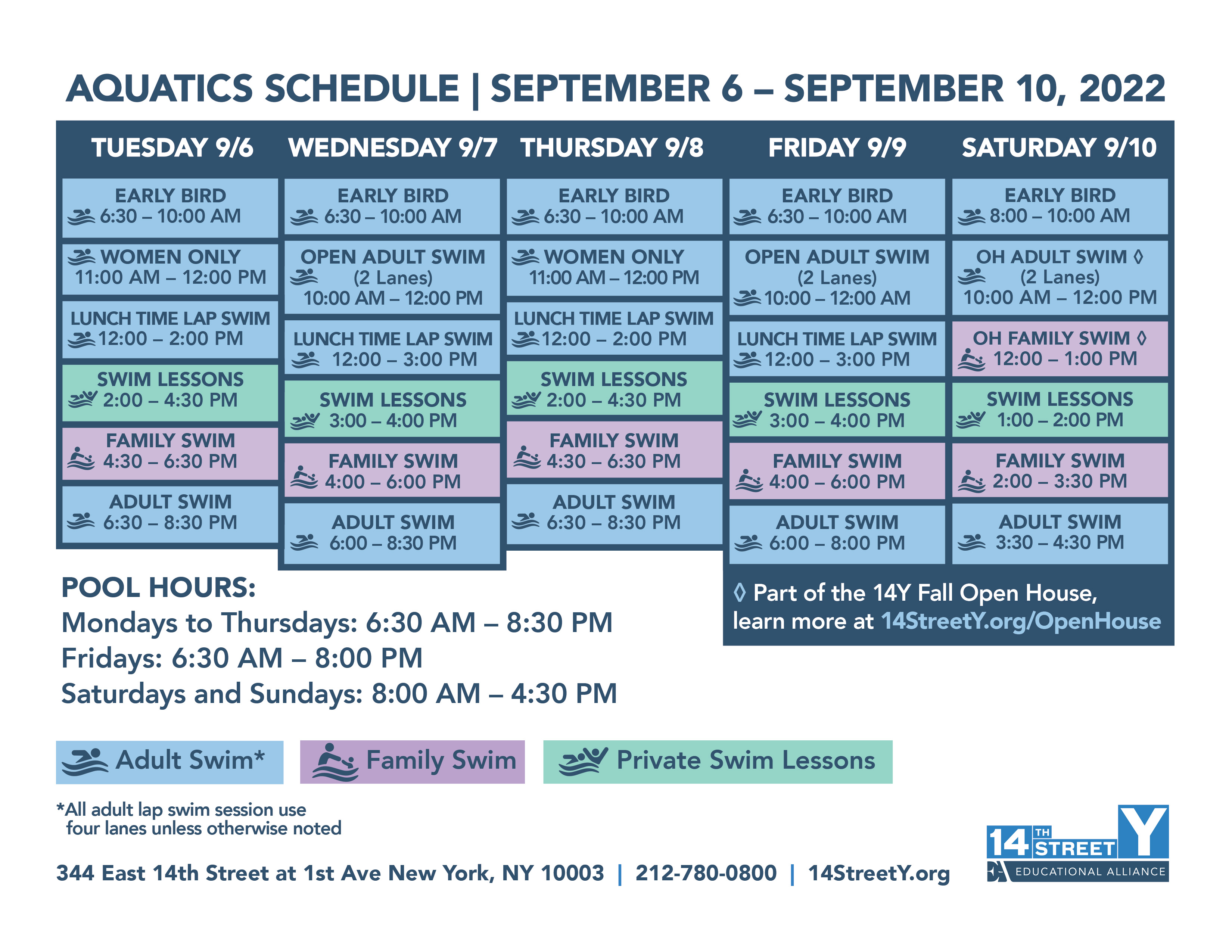

14th Street Y (Schedule Flyers)
Designing for a bustling community center requires the ability to stay on top of the constant updates and expansions. This led me to develop many templates for different formats to keep up with the community’s needs. I’m most proud of my work with the fitness and aquatics schedules, in which over time I built out systems with symbols and color-coding to help navigate so much information. After some community feedback, we adapted our color coding to be more accessible to our color-blind members, which is now something I always consider with my designs. I cherish the ability to get feedback from the 14Y community as it always makes for stronger, more legible work.
Designing for a bustling community center requires the ability to stay on top of the constant updates and expansions. This led me to develop many templates for different formats to keep up with the community’s needs. I’m most proud of my work with the fitness and aquatics schedules, in which over time I built out systems with symbols and color-coding to help navigate so much information. After some community feedback, we adapted our color coding to be more accessible to our color-blind members, which is now something I always consider with my designs. I cherish the ability to get feedback from the 14Y community as it always makes for stronger, more legible work.
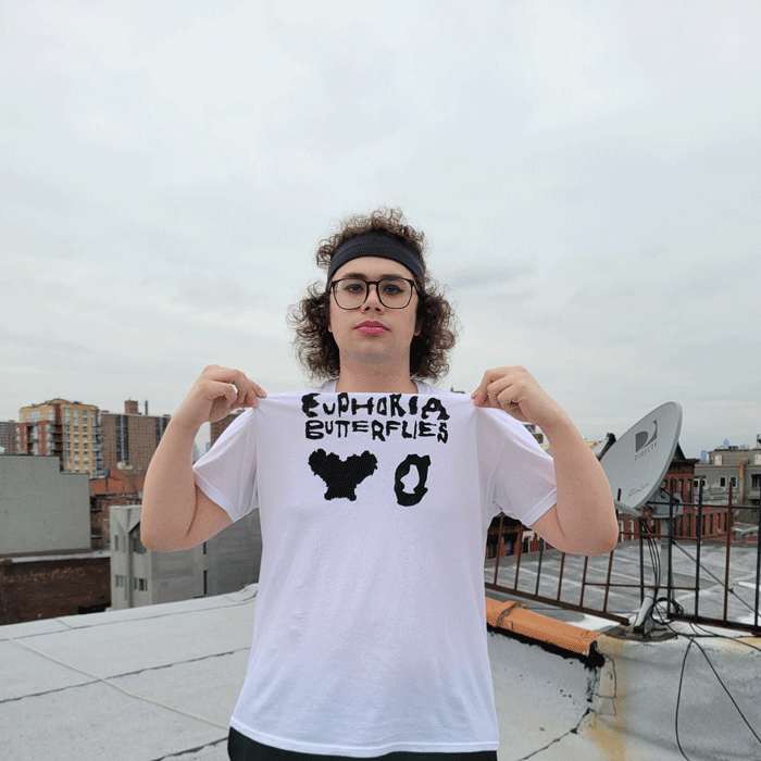
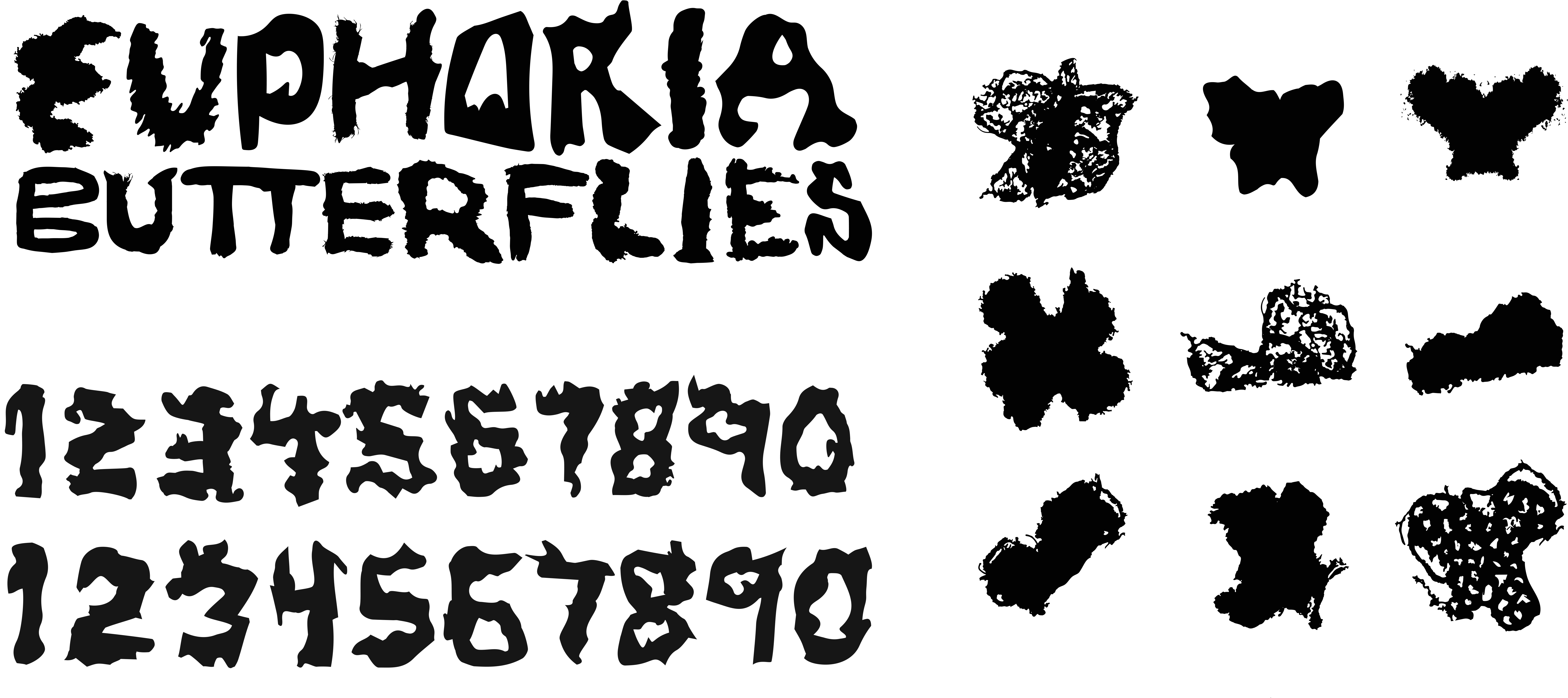
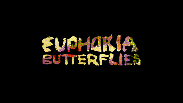
Euphoria Butterflies (Branding & Website)
For my senior thesis project, I founded a sports team identity with an emphasis on an inclusive fan experience. I wanted to re-imagine the idea of uniforms and uniformity in a way that allows for customization and leaves space for fans to participate on their own terms. This also involved taking a critical look at how current and historical design in sports has enforced the gender binary, and using that knowledge to break from the status quo. Expressive motion played heavily into the whole process, all culminating into EuphoriaButterflies.net, the website that houses the full fan experience. Aside from designing the site, there are also a few different tools, assets, and guides to allow for fans to make their own jerseys (both digital & physical) as well as profile and banner photos for social media. The site itself is even customizable, with the user able to drag elements into whatever composition they desire.
For my senior thesis project, I founded a sports team identity with an emphasis on an inclusive fan experience. I wanted to re-imagine the idea of uniforms and uniformity in a way that allows for customization and leaves space for fans to participate on their own terms. This also involved taking a critical look at how current and historical design in sports has enforced the gender binary, and using that knowledge to break from the status quo. Expressive motion played heavily into the whole process, all culminating into EuphoriaButterflies.net, the website that houses the full fan experience. Aside from designing the site, there are also a few different tools, assets, and guides to allow for fans to make their own jerseys (both digital & physical) as well as profile and banner photos for social media. The site itself is even customizable, with the user able to drag elements into whatever composition they desire.


Phase 3 Solutions Group (Digital Presentation)
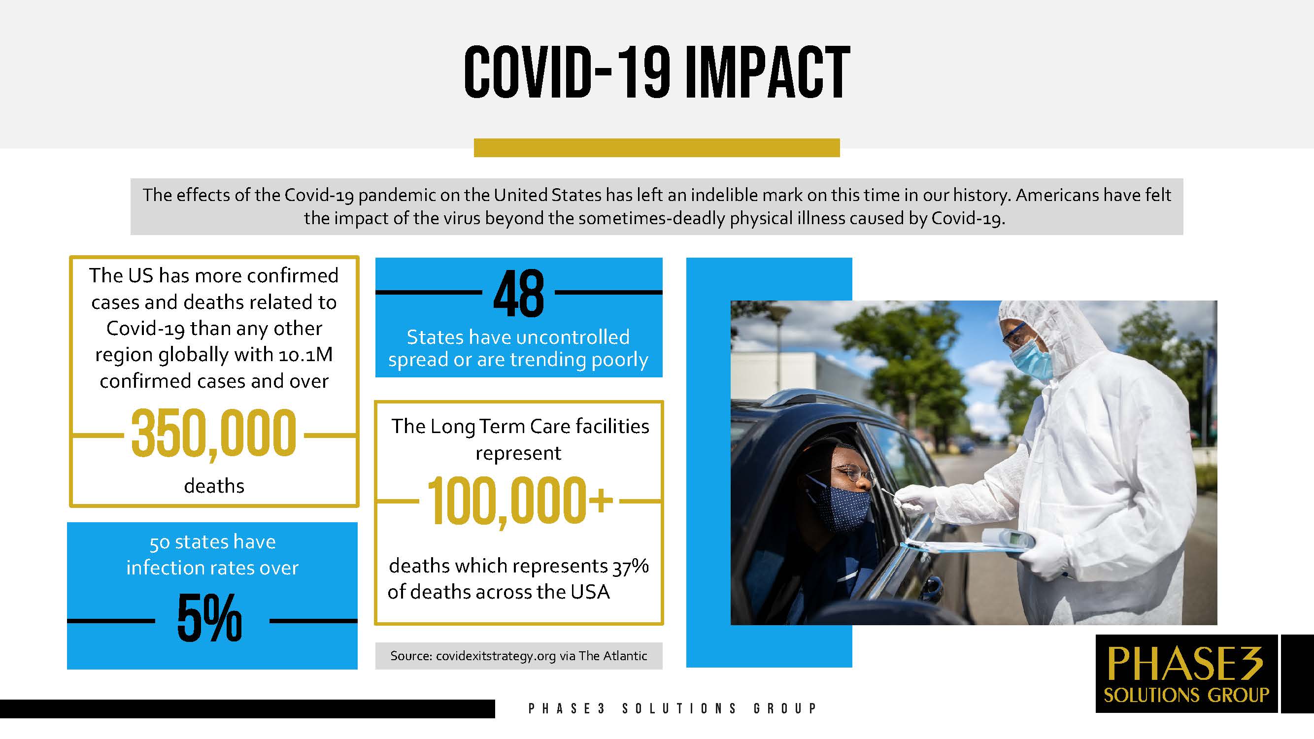
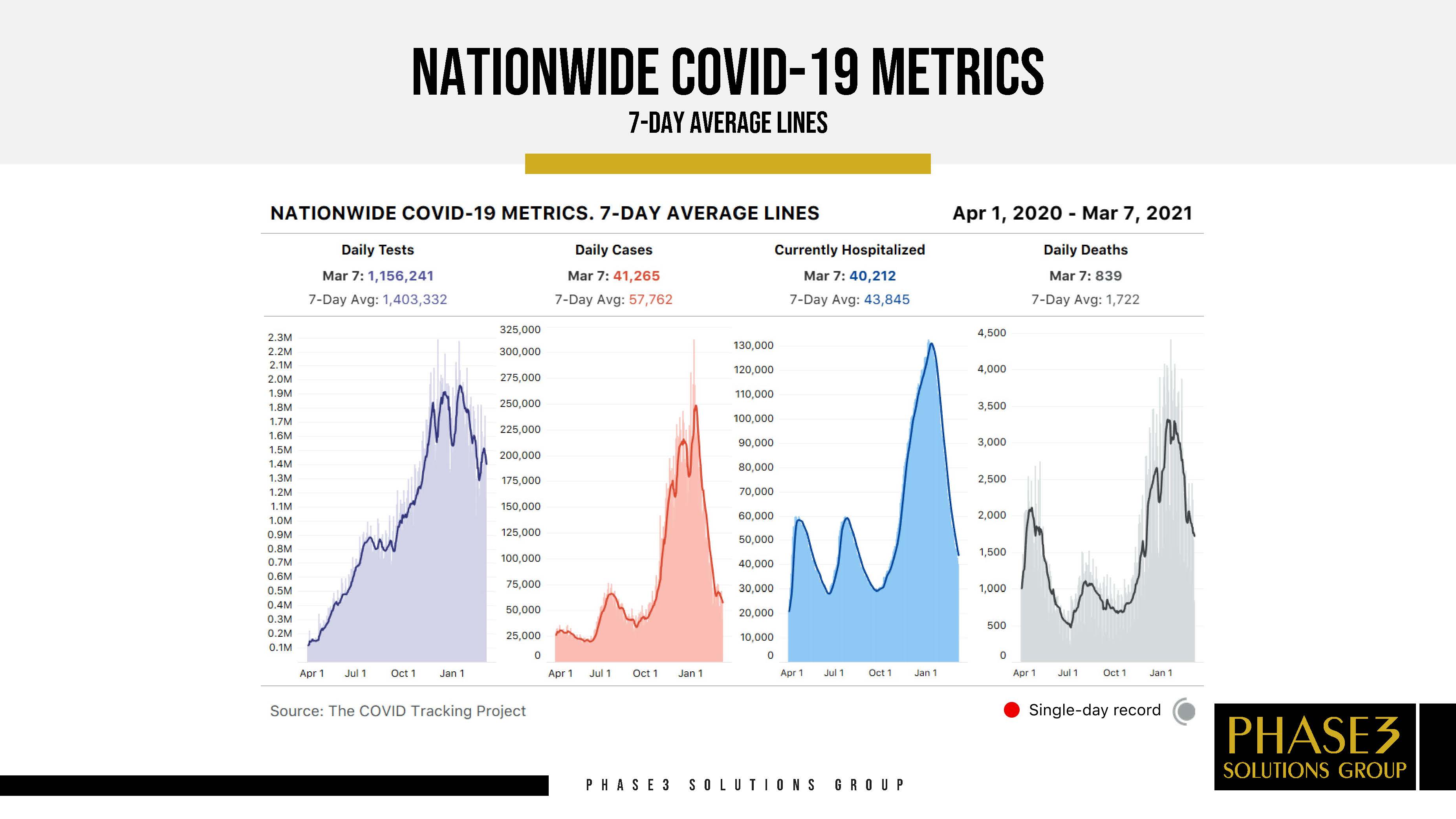
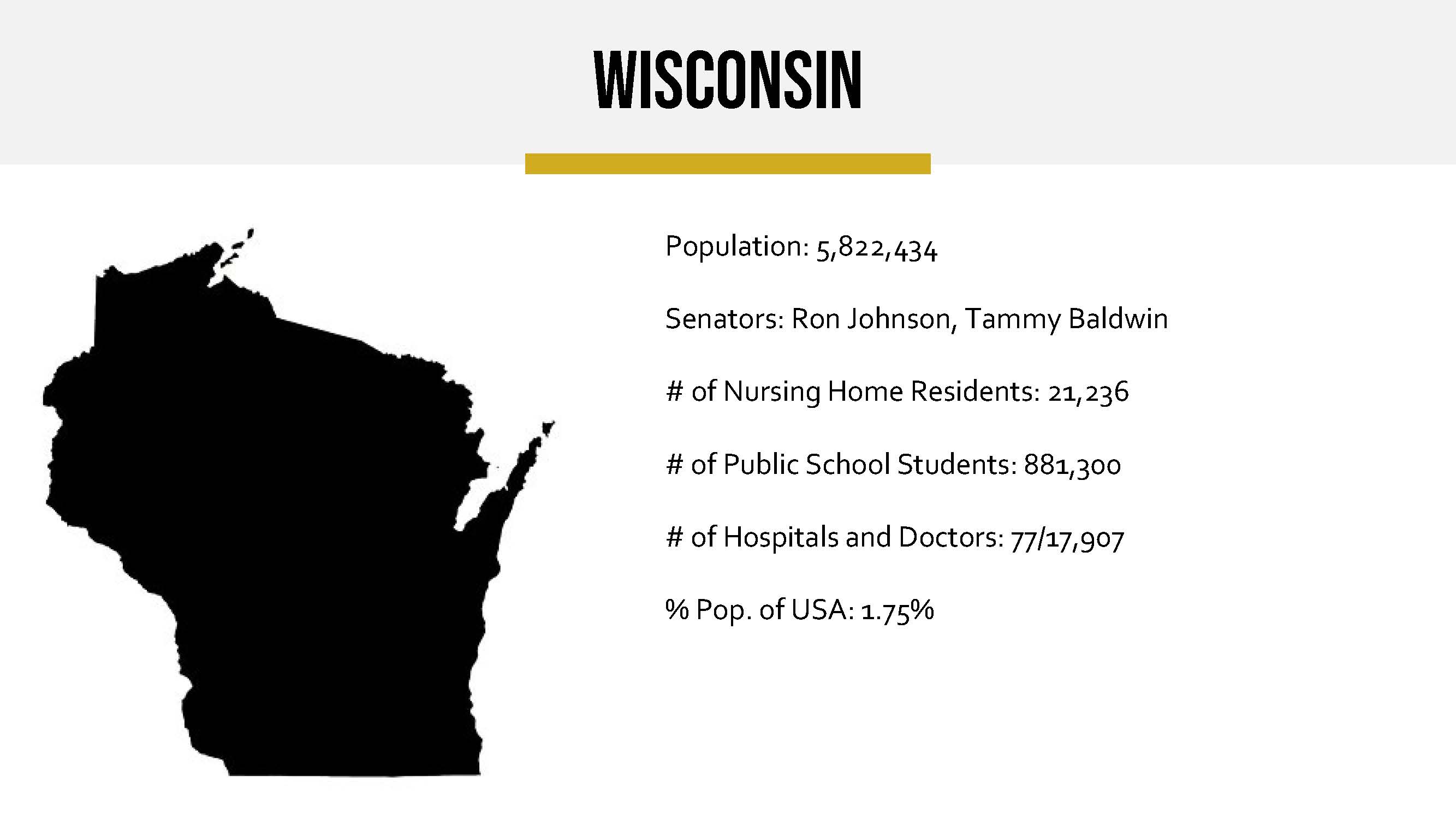
As part of my internship with DESBall Ventures, I worked on continuously refreshing and constructing new slides for this nearly 300 slide digital presentation about COVID-19 testing. I was also soley in charge of the research, creation, and implementation of the appendix which contained data for every US state as well as every country with available COVID-19 cases. Most of the presentation’s data needed weekly updating, which was another responsibility of mine. The full presentation was sent out to government officials at domestic and international levels.
As part of my internship with DESBall Ventures, I worked on continuously refreshing and constructing new slides for this nearly 300 slide digital presentation about COVID-19 testing. I was also soley in charge of the research, creation, and implementation of the appendix which contained data for every US state as well as every country with available COVID-19 cases. Most of the presentation’s data needed weekly updating, which was another responsibility of mine. The full presentation was sent out to government officials at domestic and international levels.

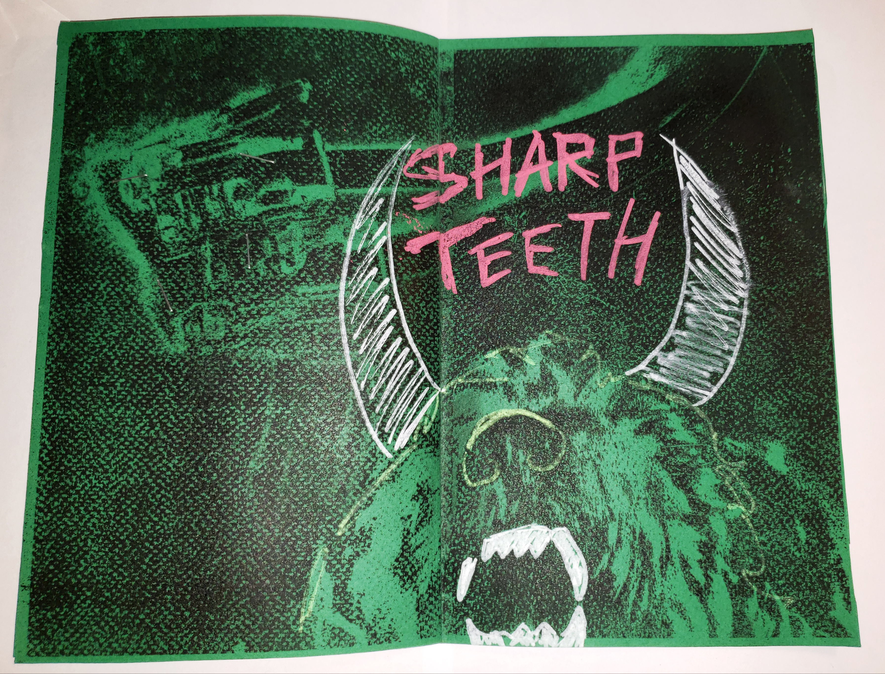

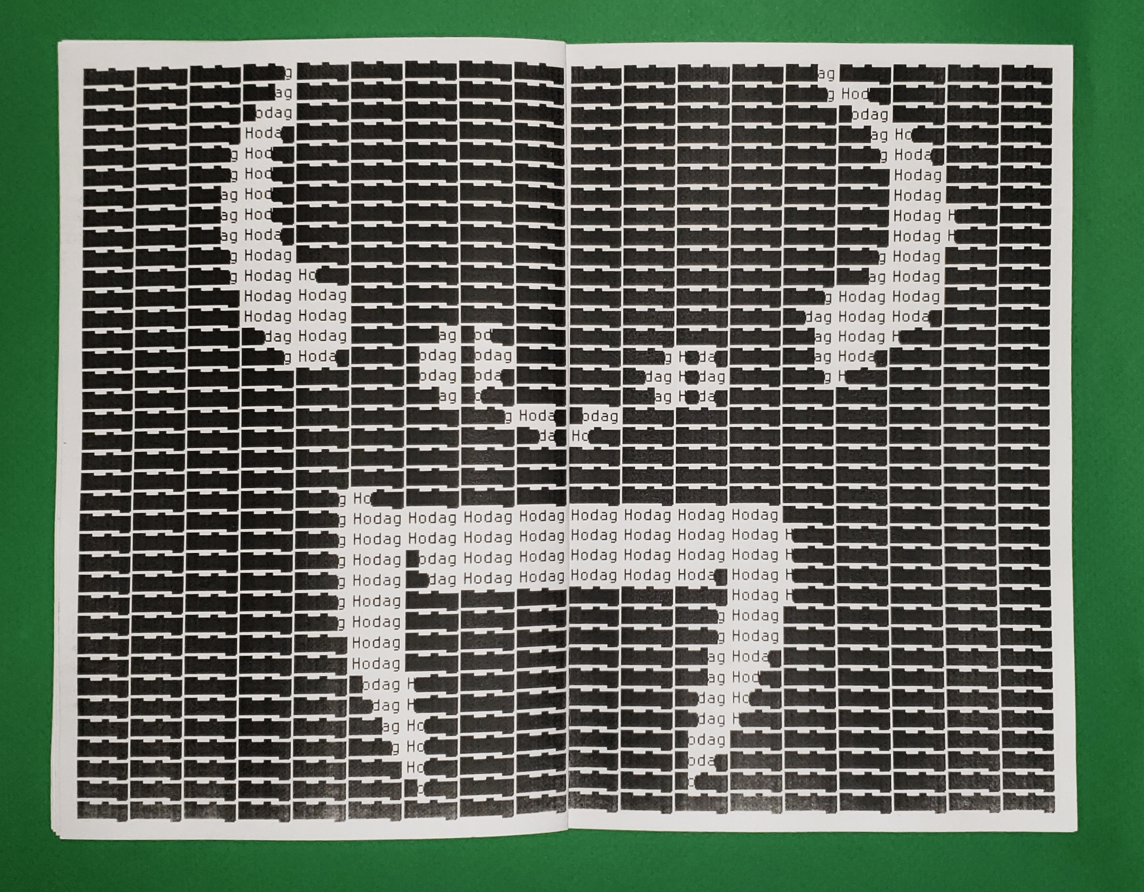
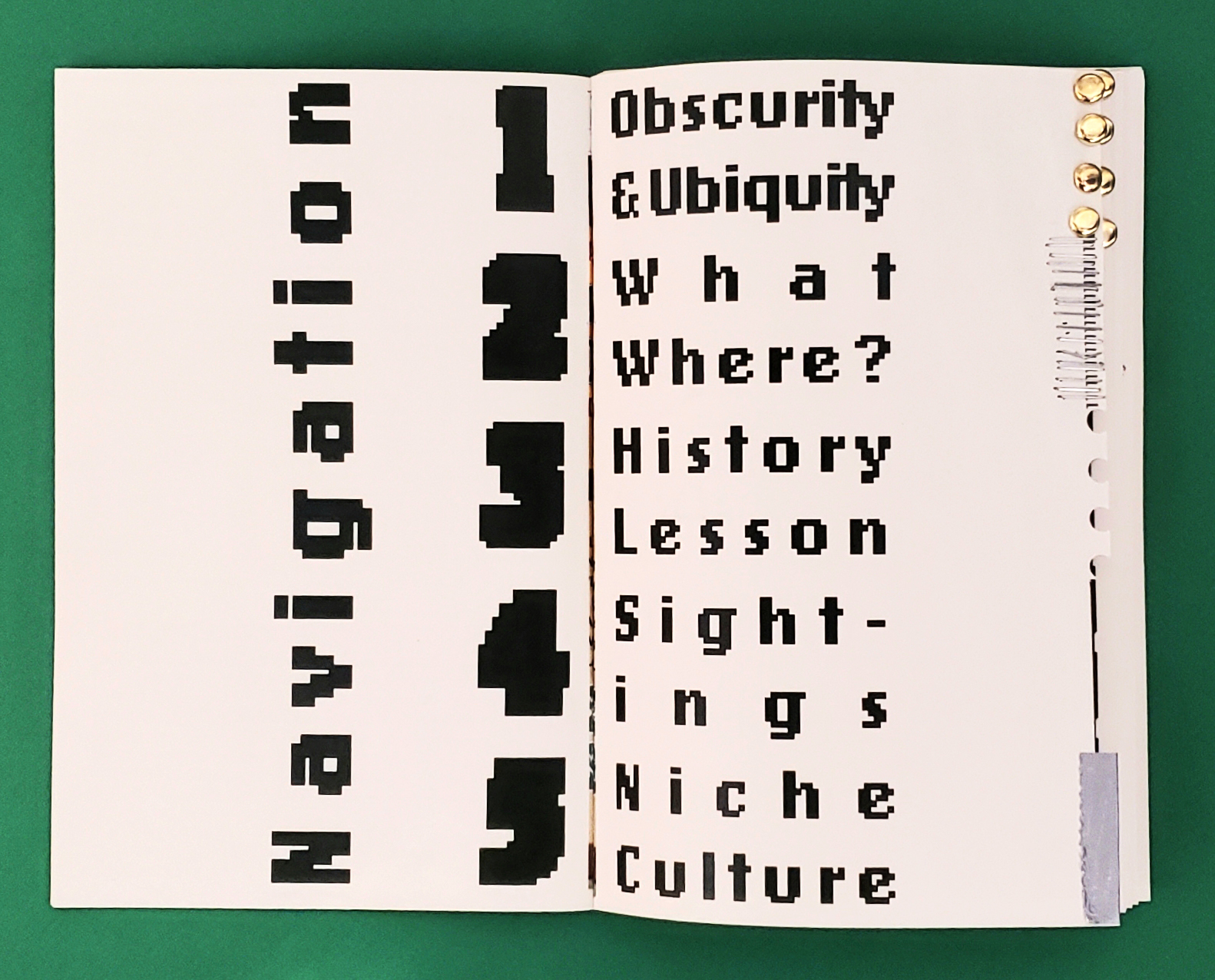
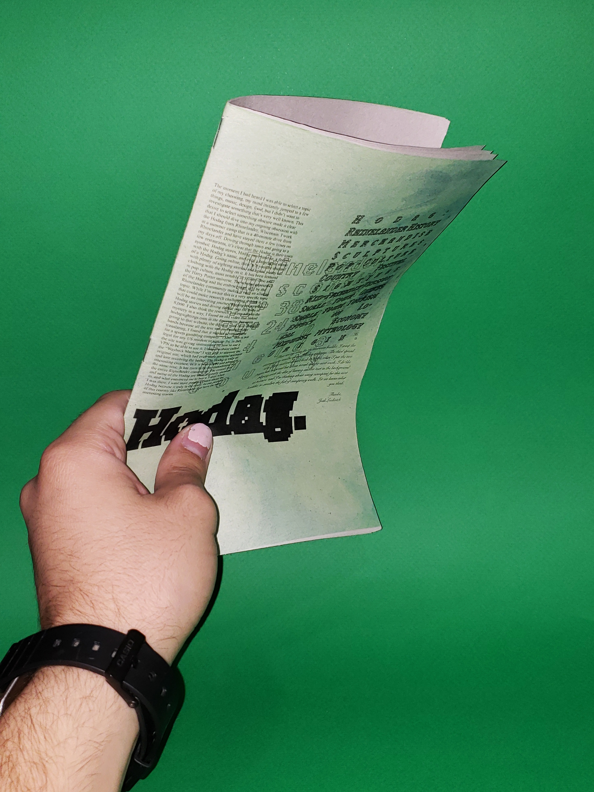
Hodag (Printed Book)
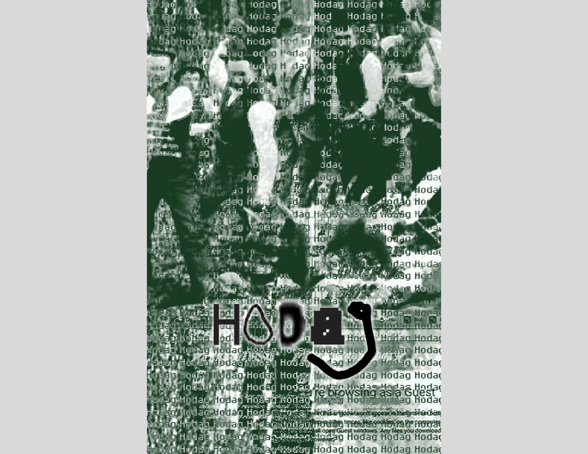
This 100-page print book was conceptualized, researched, and constructed all by myself. Starting as a series of 4 booklets, I eventually expanded the Hodag topic into 5 different chapters. The Hodag is a mythical creature embedded in the folklore of Rhinelander, a small northern Wisconsin town. This book gets at the ubiquity of the Hodag within the small town, and the obscurity of the Hodag everywhere else. Investigating this topic was quite interesting and demanding, as information is hard to come by online, which is a process that ended up as part of the narrative as well as informing many of the design choices I made along the way. Merging the aesthetics of rural forests and internet culture was challenging but incredibly satisfying once I was able to strike that balance.
You can check out the full book here

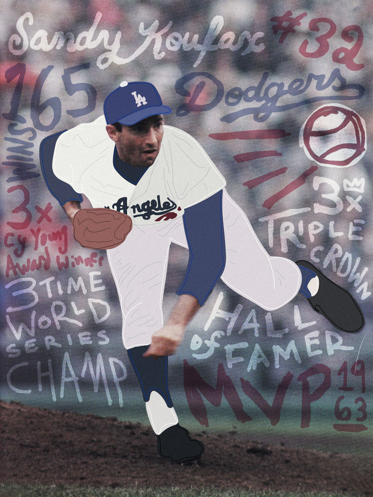

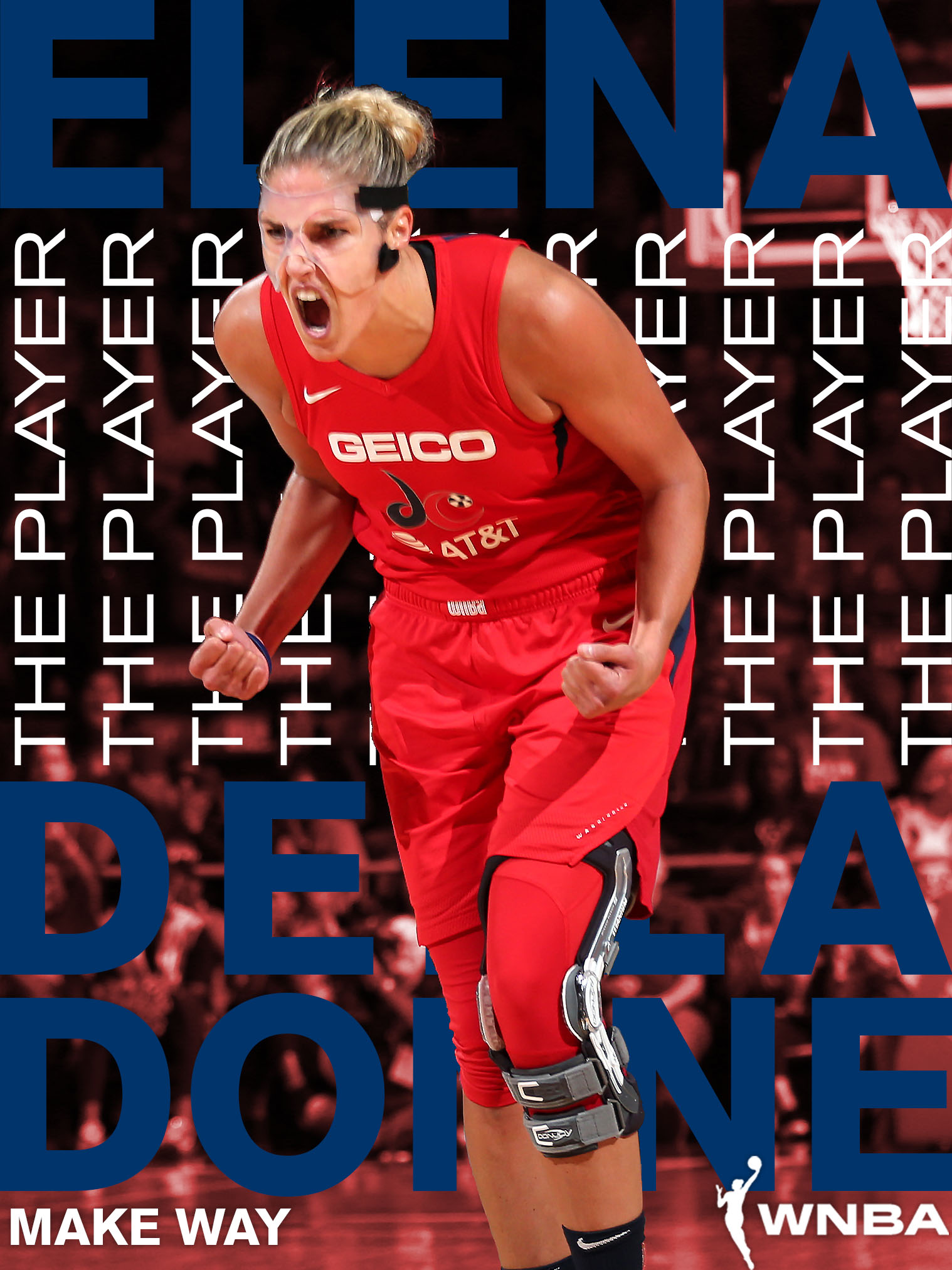

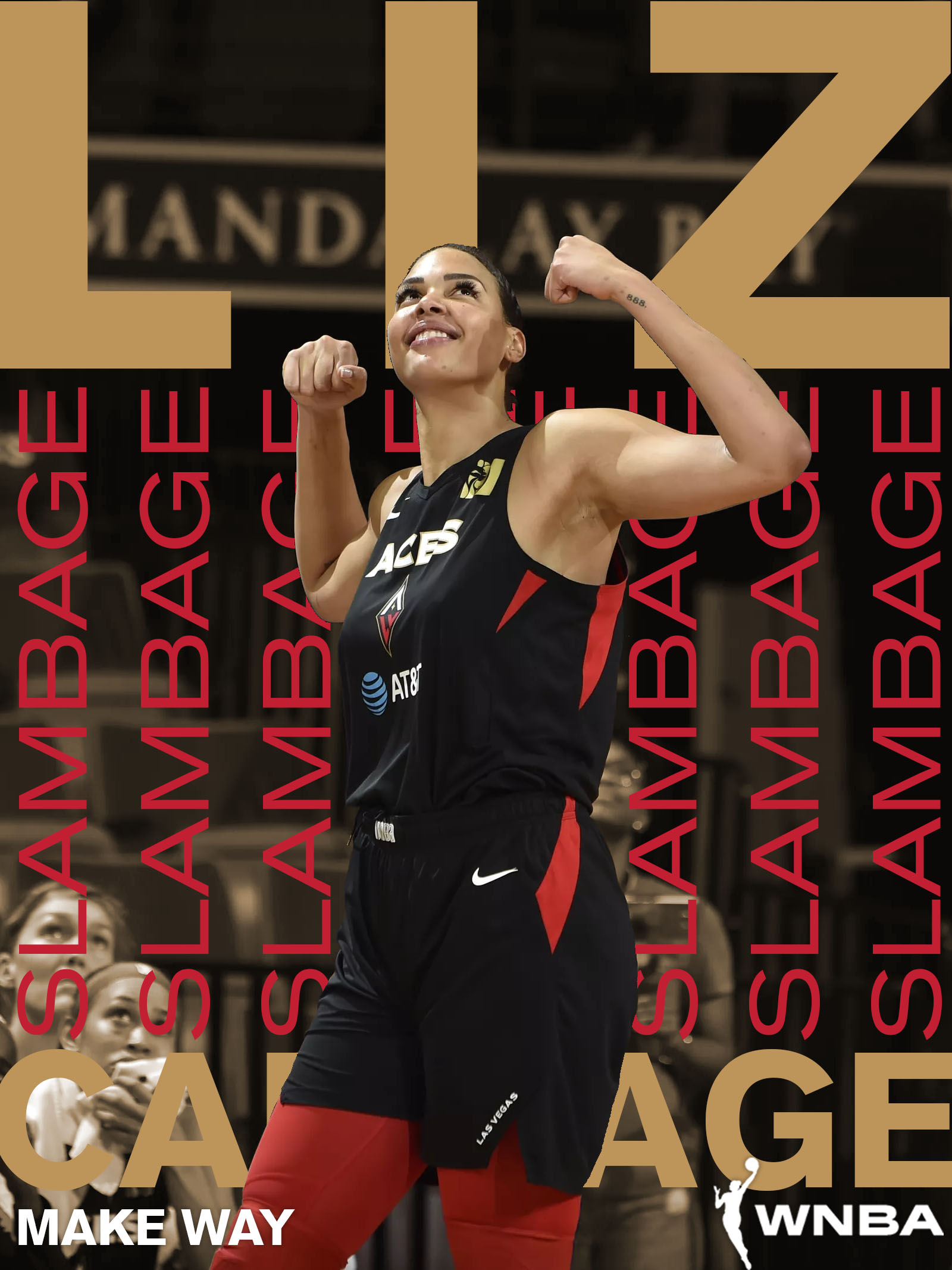
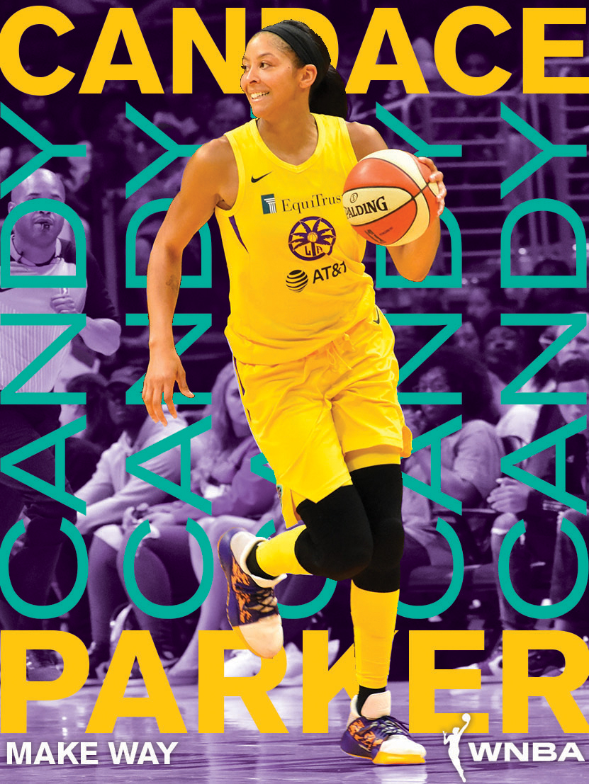
Various Sports Graphics (Digital)
Multiple sports graphics playing with typography to highlight what makes different athletes so special. The WNBA series was created to bring awareness to players’ nicknames, which is such a big part of sports culture that is underutilized as part of the conversations around the WNBA. Stats are also a huge part of sports, and some of these graphics play with text as texture, creating fields of data and achievements into a new type of sports infographic. I see it as a digital baseball card that takes the best of both sides of the card and layers it into one image.
Multiple sports graphics playing with typography to highlight what makes different athletes so special. The WNBA series was created to bring awareness to players’ nicknames, which is such a big part of sports culture that is underutilized as part of the conversations around the WNBA. Stats are also a huge part of sports, and some of these graphics play with text as texture, creating fields of data and achievements into a new type of sports infographic. I see it as a digital baseball card that takes the best of both sides of the card and layers it into one image.
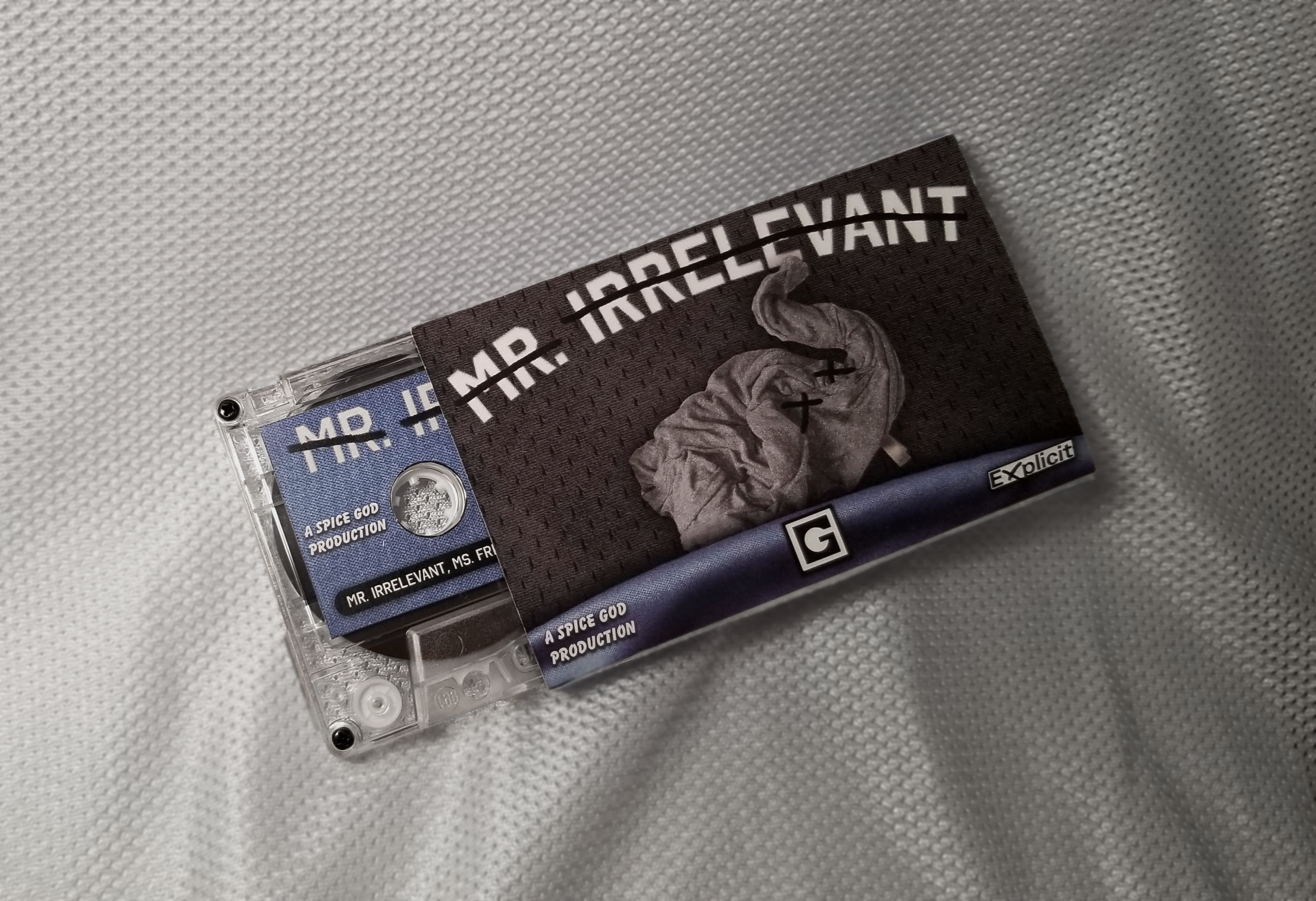
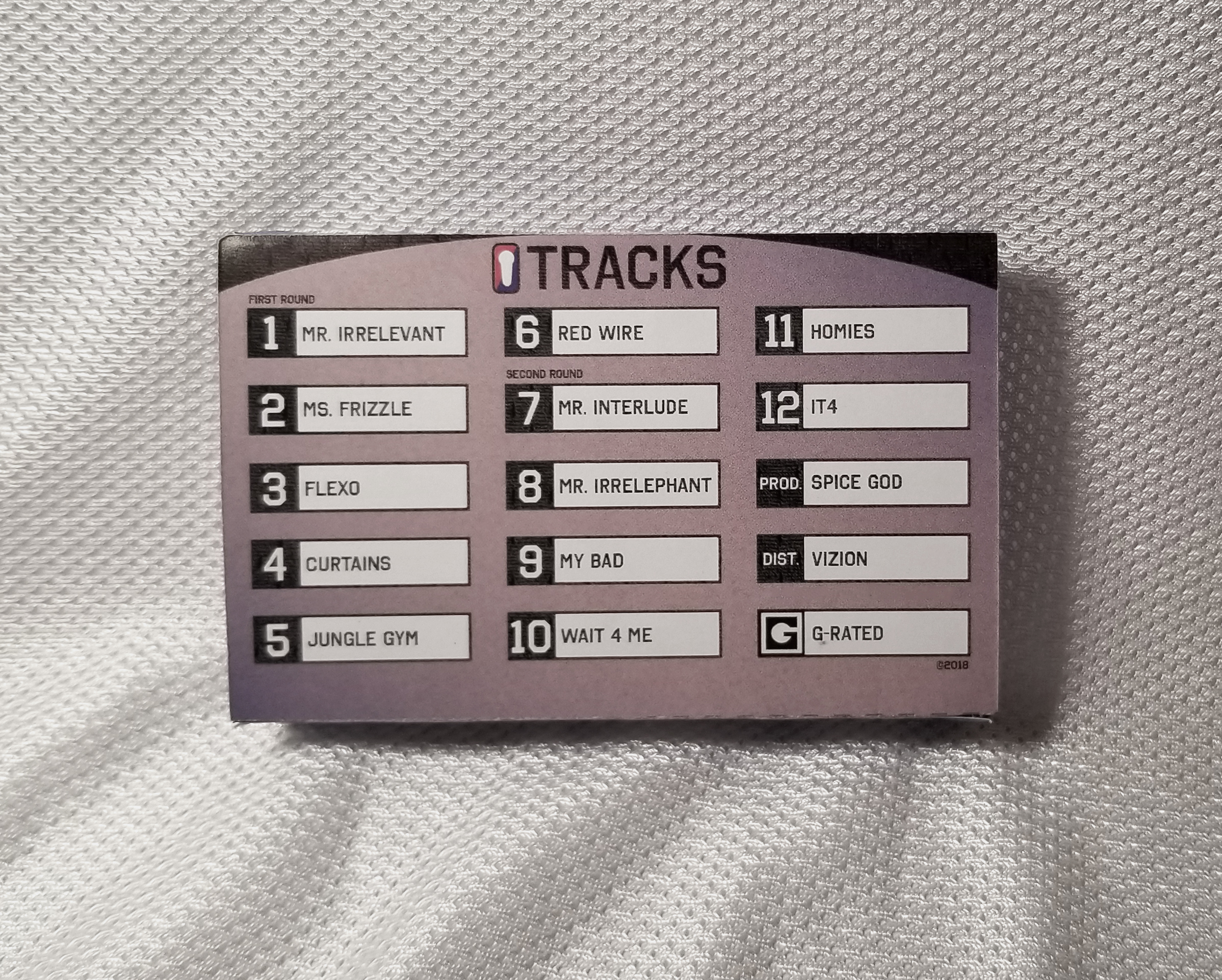
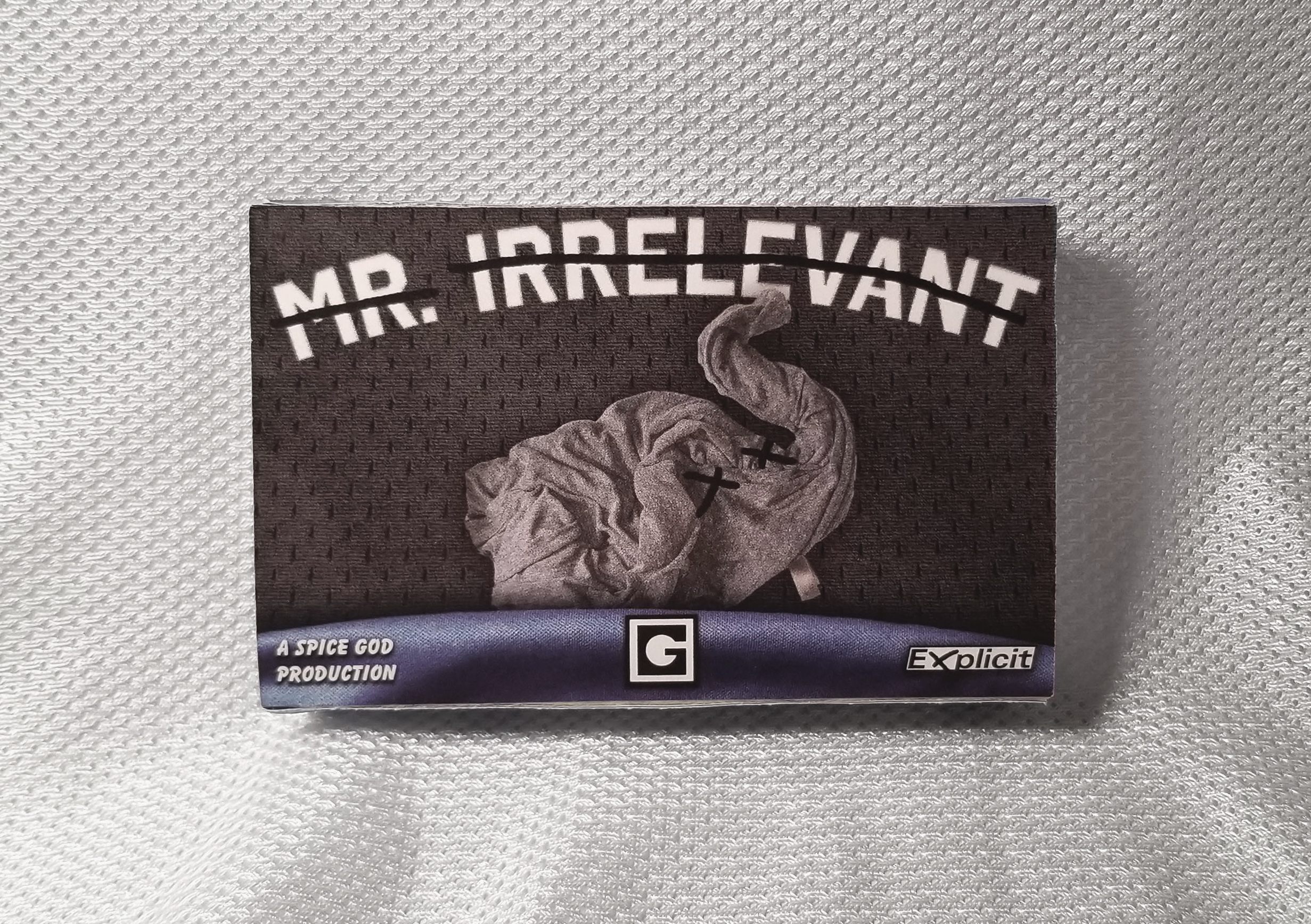

Mr. Irrelevant Cassette (Packaging)
This cassette tape packaging allowed to create a more complete visual album experience than just cover art, as there were so many places and sides to design for. With the album being my own, I was able to design with deeper themes in mind, and offer a visual component to pair with the music. Doing this packaging really helped me think about designing with multiple senses in mind and seeing things less as products and more as full experiences.
You can listen to the album here
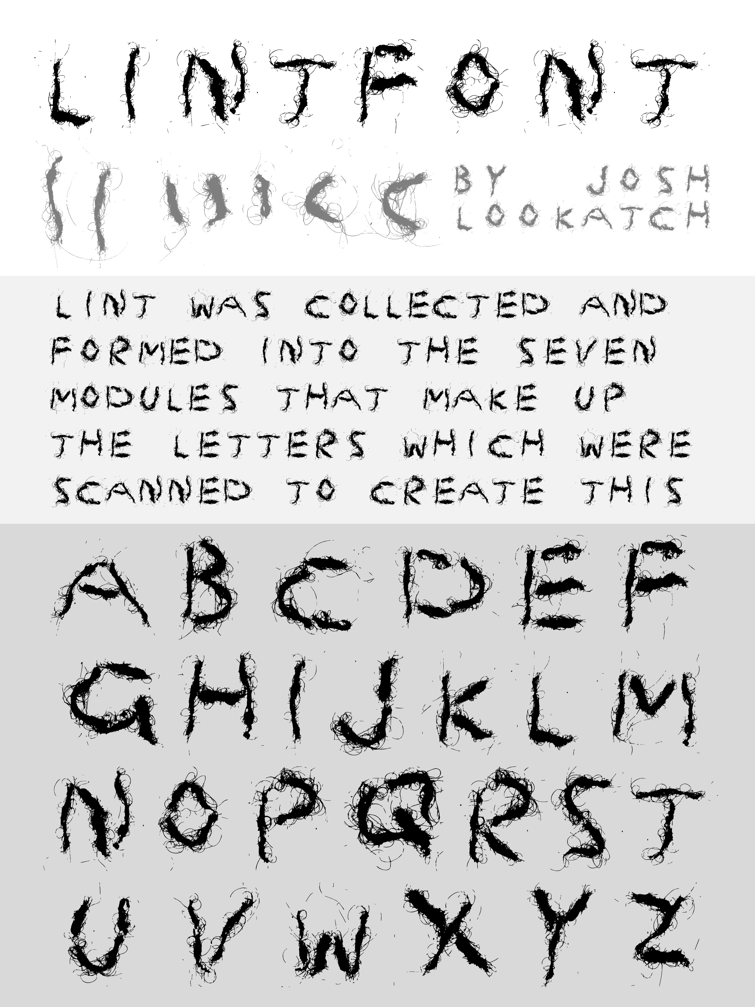
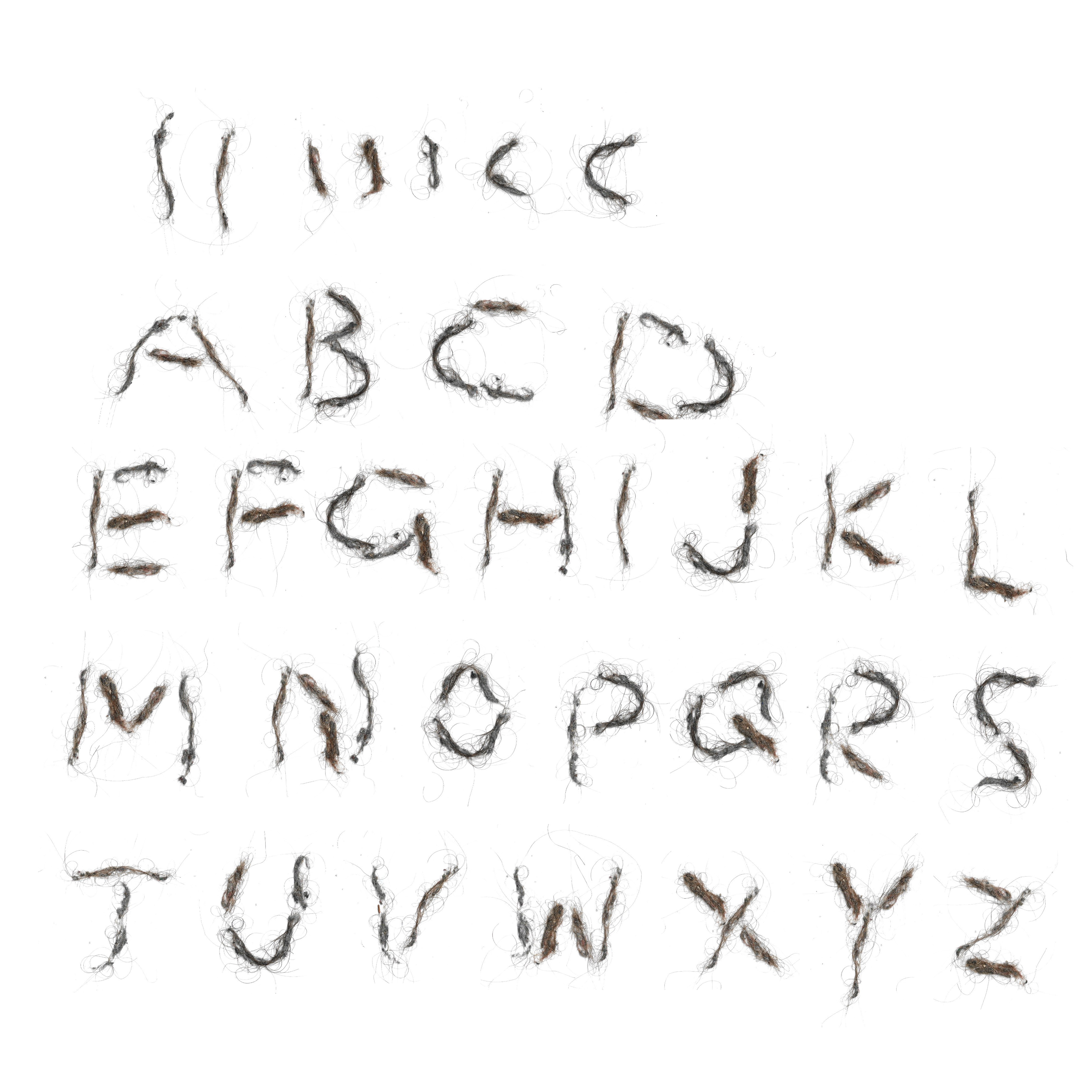
LINTFONT (Type Design)
This modular typeface was the end result of multiple weeks of investigation and play between lint rollers, lint, and the forms it could create. Seven formed lint pieces serve as the tools from which all letters were constructed. Each letter was shaped and scanned into a working typeface. It was fun being able to turn something as mundane as lint into an expressive typeface, as well as being able to digitize something that is so physical.
This modular typeface was the end result of multiple weeks of investigation and play between lint rollers, lint, and the forms it could create. Seven formed lint pieces serve as the tools from which all letters were constructed. Each letter was shaped and scanned into a working typeface. It was fun being able to turn something as mundane as lint into an expressive typeface, as well as being able to digitize something that is so physical.
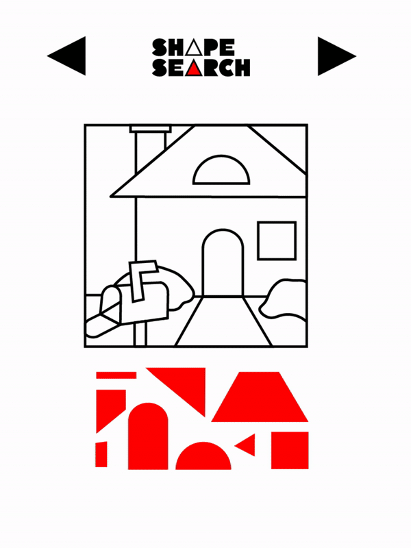
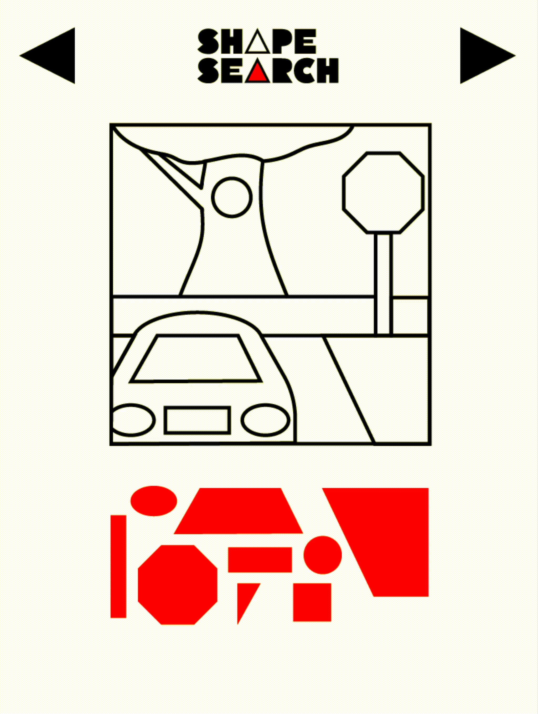
Shape Search (Mobile App Design)
These prototype videos are a part of a concept for a focus building app made for younger kids with ADHD called Shape Search. The app challenges kids to find geometric shapes within illustrations, offering an experience that’s much like a word search, but with shapes. When all shapes are swiped into place, the illustration will fill with full color. The illustrations, style, and branding were all integrated by myself with the goal of giving kids a fun way to learn and recognize lines, shapes, and compositions.
These prototype videos are a part of a concept for a focus building app made for younger kids with ADHD called Shape Search. The app challenges kids to find geometric shapes within illustrations, offering an experience that’s much like a word search, but with shapes. When all shapes are swiped into place, the illustration will fill with full color. The illustrations, style, and branding were all integrated by myself with the goal of giving kids a fun way to learn and recognize lines, shapes, and compositions.